The sine graph is one of the most fundamental trigonometric graphs in mathematics. It represents how the sine function, written as y = sin(x), changes as the angle x varies. In this tutorial, we explore how to draw the graph of sin x, its shape, key characteristics, and how it compares to cosine and sine graphs commonly seen in trigonometry.
Table of Contents
- What Is the Sine Graph?
- How to Graph the Sine Graph Step-by-Step
- Understanding the Shape of the Graph of sin x
- General Form of Peaks and Troughs on the Sine Graph
- Comparing Cosine and Sine Graphs
- Common Mistakes When Graphing the Sine Graph
- Tips for Graphing Sine Graph
- Did You Know?
- Frequently Asked Questions
- Related Graph Types to Explore
- Conclusion
What Is the Sine Graph?
The sine graph represents how the sine function changes as the angle increases, creating a smooth, continuous wave that repeats every radians. This curve shows how values rise and fall in a predictable pattern, making it one of the most recognizable and widely used graphs in mathematics. The graph is especially useful for showing periodic behavior, where a pattern repeats in cycles over time.
This wave-like motion makes the sine graph ideal for modeling real-world phenomena such as sound waves, alternating current electricity, tides, and motion in physics. Its repeating nature helps students and professionals visualize how values oscillate above and below a central axis.
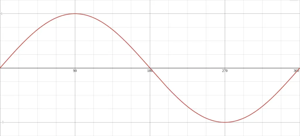
The graph of sine function shows how the value of sine changes smoothly between –1 and +1 as the angle increases. It is a wave-like curve that repeats every 360° (or 2π radians).
Equation: y = sin(x)
Key features of the sine graph:
- Amplitude: 1 (the height of the wave)
- Period: 360° (or 2π radians)
- Range: –1 ≤ y ≤ 1
- Starting Point: At x = 0°, y = 0
| x (degrees) | y = sin(x) |
|---|---|
| 0° | 0 |
| 90° | 1 |
| 180° | 0 |
| 270° | –1 |
| 360° | 0 |
This table, sometimes called a sine chart, helps visualize how the values repeat in each cycle.
How to Graph the Sine Graph Step-by-Step
Graphing the sine function is easier when you break it into small, predictable steps. Each stage helps you see how key features, such as amplitude, period, and midline, shape the overall curve. Understanding these steps also makes it simpler to sketch transformations like vertical shifts, stretches, or reflections.
By following a consistent process, you’ll be able to create accurate graphs whether you are using graph paper, a calculator, or graphing software.
- Draw the axes: Label the x-axis in degrees (0°, 90°, 180°, 270°, 360°) and the y-axis from –1 to +1.
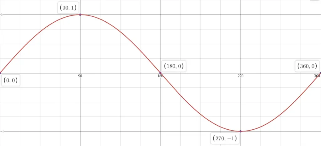
- Plot key points: Use the sine chart above to mark each point.
- Sketch the curve: Connect the points smoothly with a flowing, wave-like shape.
- Extend the pattern: The sine graph repeats every 360°, so continue to the left and right for multiple cycles.
The following image shows the key points plotted on the graph.
For clarity, plot the function y = sin(x) in degrees mode on graphing software like Desmos. The image below shows the settings in Desmos used to get the graph shown above. The table at the top left of the Desmos window is optional. That is, inserting this table adds points on the graph.

Understanding the Shape of the Graph of sin x
The sine curve has a smooth, flowing shape because it is derived from circular motion. As the angle increases, the vertical value rises gradually to a maximum, falls through the midline, and reaches a minimum before climbing back up. This pattern continues indefinitely, creating a consistent rhythmic cycle.
What makes the sine graph unique is how evenly it transitions between its highest and lowest points. There are no sharp corners or abrupt changes, everything is continuous. The peaks occur at and the troughs at , giving the graph its iconic wave shape.
The graph also has a central horizontal line called the midline, typically the x-axis, which acts as a balance point between positive and negative values. The distance from the midline to the maximum or minimum is the amplitude, a key measurement that shows how “tall” the wave is.
The graph of sin x forms a smooth oscillating curve. Starting from 0, it rises to +1 at 90°, falls back to 0 at 180°, drops to –1 at 270°, and returns to 0 at 360°.
This pattern repeats indefinitely, making the sine graph periodic and continuous. It is ideal for representing waveforms, circular motion, and oscillating signals.
General Form of Peaks and Troughs on the Sine Graph
Because the sine graph is periodic, its highest and lowest points repeat at regular intervals. Instead of listing just the first peak or trough, mathematicians use a general form that describes all locations of these repeating features. This general form uses the variable , which represents any integer, to capture every cycle of the wave across the x-axis.
The sine function reaches its maximum value of +1 at:
This means the first peak occurs at , and every additional peak is exactly one full period () further along the x-axis.
Likewise, the graph reaches its minimum value of –1 at:
This reflects the same repeating pattern. The first trough appears at , and all other troughs occur at increments of one period.
Using the general form helps describe the entire infinite sine wave rather than just a single cycle. It provides a clear, universal way to identify every point where the sine graph hits its maximum or minimum value, no matter how far left or right you move along the x-axis.
Comparing Cosine and Sine Graphs
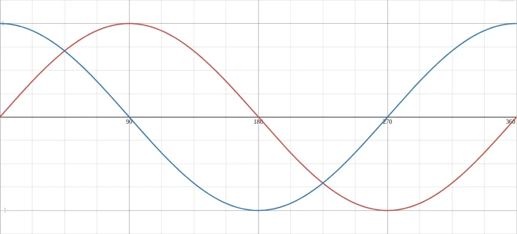
The sine and cosine graphs share the same smooth, wave-like structure, which makes sense because both come from circular motion. The main difference is where each graph begins. While the sine graph starts at zero and moves upward, the cosine graph starts at its maximum value. This shift means the two graphs have the same shape but are offset horizontally.
Due to their relationship, sine and cosine can often replace one another in equations and models. Recognizing how they overlap helps you understand trigonometric identities and transformations more intuitively.
The cosine sine relationship is close and consistent. The cosine graph looks almost identical to the sine graph, just shifted 90° to the left.
| Function | Equation | Shift | Period | Amplitude |
|---|---|---|---|---|
| Sine | y = sin(x) | Starts at 0 | 360° | 1 |
| Cosine | y = cos(x) | Starts at 1 | 360° | 1 |
When plotted together, the graph of sine and cosine functions shows how these two curves follow the same pattern but are out of phase by 90°.
You can easily visualize this by plotting both y = sin(x) and y = cos(x) in Desmos to create a graph of sine and cosine functions side by side. The following image shows both graphs plotted in Desmos.
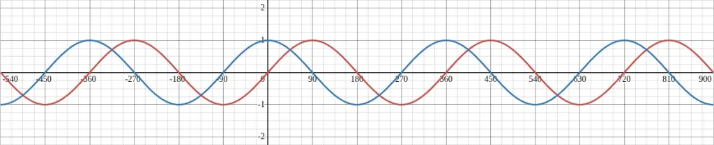
The same graph as above is shown below, but over a longer x axis that shows the repeating pattern of both graphs.
Common Mistakes When Graphing the Sine Graph
When graphing the sine function, students often misplace key points such as peaks, troughs, and intercepts. These mistakes usually happen when the period or amplitude is not identified correctly before sketching. Forgetting to mark important reference angles can also cause the curve to appear distorted.
Another common error is drawing the wave with uneven spacing. The graph must rise and fall smoothly and symmetrically across each cycle. Taking time to plot critical points ensures the wave maintains its natural rhythm.
- Using radians instead of degrees accidentally: Always check your graphing mode.
- Incorrect amplitude scaling: Ensure the y-axis is correctly scaled between –1 and 1.
- Missing the repeating pattern: Extend your graph beyond 360° to show periodicity.
- Forgetting smooth curves: The sine wave is continuous, not straight lines between points.
Tips for Graphing Sine Graph
A good sine graph always starts with identifying the amplitude, period, phase shift, and vertical shift. These four components determine how the wave looks and where it sits on the coordinate plane. Labeling these values first helps guide the shape of the curve.
It also helps to sketch one complete cycle before extending the graph. Once the first wave is accurate, repeating the same pattern makes the rest of the graph consistent and easy to draw.
- Always label key points like 0°, 90°, 180°, 270°, and 360°.
- Use grid lines or asymptotes for accurate plotting.
- If comparing with cosine, color-code the curves for easy distinction.
- When plotting in Desmos, switch to degrees mode for simpler interpretation.
Did You Know?
Sine waves are everywhere in the real world. They describe sound waves, electromagnetic radiation, alternating current, musical tones, and even the motion of springs and pendulums. This is why understanding the sine graph is so valuable, it connects basic math to many scientific and engineering applications.
The sine function comes from the study of triangles and circles in ancient geometry. The term “sine” originates from the Latin word sinus, meaning “curve” or “fold.”
Today, the sine graph is used far beyond math, it models sound waves, alternating current, and even ocean tides. Its smooth, repeating shape makes it one of the most recognizable mathematical graphs in the world.
Frequently Asked Questions
What is the equation of the sine graph?
The equation is y = sin(x). It shows how the sine of an angle changes between –1 and +1 as x increases.
How often does the sine graph repeat?
It repeats every 360° (or 2π radians), meaning it’s a periodic function. The period is the length of one complete cycle of the graph. The standard sine graph has a period of . If the function is written as the period becomes , meaning the graph cycles faster or slower depending on the value of .
What’s the difference between the sine and cosine graphs?
They have the same shape and amplitude, but the cosine graph starts at its maximum value, while the sine graph starts at zero.
What is the amplitude of the sine graph?
The amplitude is 1, representing the maximum distance from the x-axis. The amplitude is the distance from the midline of the graph to its maximum or minimum value. For the basic function , the amplitude is 1. If a coefficient multiplies the sine function, that coefficient becomes the amplitude and changes how tall the wave appears.
How do I make a graph of sine in Desmos?
In Desmos, type y = sin(x) and ensure you’re in degrees mode if you want the x-axis labeled in degrees. Also set the X-Axis range and step so that the graph is displayed correctly.
What is a sine chart?
A sine chart lists common sine values at key angles like 0°, 30°, 45°, 60°, and 90°, helping you sketch the curve quickly.
Related Graph Types to Explore
Once you understand the sine graph, it becomes much easier to explore other trigonometric graphs such as cosine and tangent. These related functions share many features with the sine curve but introduce their own unique characteristics. Studying them together helps strengthen your understanding of trigonometric relationships and patterns.
Other periodic graphs and waveforms used in science and engineering, such as square waves, sawtooth waves, and piecewise periodic functions, also build on the principles you learn from the sine graph. Exploring these graphs can help you see how wave behavior changes across different applications.
If you’re learning trigonometric functions, also check out:
These guides show how the graph of sine connects to other periodic functions.
Conclusion
The sine graph is the foundation of trigonometric graphing. By understanding the graph of sin x, its amplitude, and periodic nature, you can easily extend your knowledge to cosine and tangent. Whether for math class or real-world applications, mastering the graph of sine function helps build intuition for wave motion and oscillations.
To explore more trigonometric functions and examples, visit our Trigonometry Graphs category for step-by-step guides and graphing tutorials.