Creating pie charts is one of the simplest ways to visualize how different parts contribute to a whole. Whether you want to create a pie chart in Excel, Google Sheets, or another tool, learning how to make one helps you communicate data clearly. In this tutorial, you’ll learn how to make your own pie chart using free and accessible software, no design skills required.
Table of Contents
- What Is a Pie Chart?
- How to Make a Pie Chart in Google Sheets
- How to Create a Pie Chart in LibreOffice Calc
- Creating Pie Charts in Excel
- Tips for Graphing: Creating Pie Charts
- Did You Know About Creating Pie Charts?
- Common Mistakes When Graphing Creating Pie Charts
- Related Graph Types to Explore
- Frequently Asked Questions About Creating Pie Charts
- Conclusion on Creating Pie Charts
What Is a Pie Chart?
A pie chart is a circular graphic used to show how individual parts contribute to a whole, making it ideal for quick comparisons between categories. Its structure allows viewers to see proportions immediately, even without reading numbers, which is why this type of chart is so common in business reports, surveys, and presentations.
Another helpful feature of a pie chart is its intuitive design, most people can interpret it at a glance. Because each slice directly corresponds to a percentage of the total, this chart type is particularly effective when you need to emphasize which category dominates and how the remaining categories compare in size.
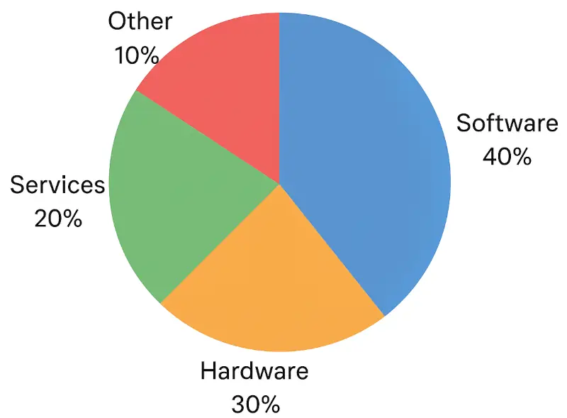
A pie chart (or circle graph) represents data as slices of a circle. Each slice shows the proportion of a category relative to the total. Pie charts are perfect for visualizing percentages, market shares, or any data set that adds up to 100%.
For example, if you have sales data for different product types, a pie chart lets you instantly see which category dominates the market. The image shows an example of a pie chart.
How to Make a Pie Chart in Google Sheets
Before creating your pie chart, it helps to understand how Google Sheets transforms your data into a visual breakdown. Google Sheets automatically sums your categories, calculates proportions, and assigns color values, making the process quick even if your dataset is simple. This makes it an excellent tool for beginners or anyone who needs a clean visual without complex formatting.
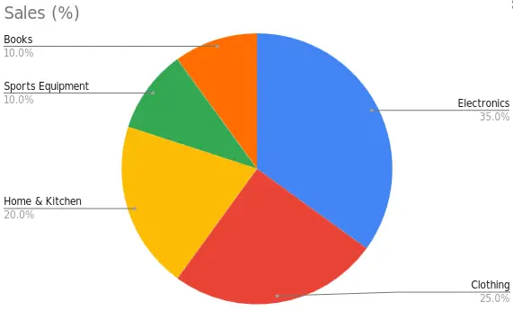
If you prefer working online, Google Sheets is a convenient and free tool to make a pie chart free using your browser. Use the following example data when following the instructions to make a pie chart below.
| Category | Sales (%) |
|---|---|
| Electronics | 35 |
| Clothing | 25 |
| Home & Kitchen | 20 |
| Sports Equipment | 10 |
| Books | 10 |
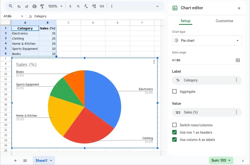
Steps to Make a Pie Chart in Google Sheets
Creating a pie chart in Google Sheets involves selecting properly organized data so the chart tool can interpret it correctly. By choosing a label column and a corresponding values column, you ensure that Google Sheets can assign each slice to the correct percentage. The steps are straightforward, but small details such as labeling or formatting can significantly improve the final result.
- Enter your data in two columns.
- Highlight the data and go to Insert → Chart.
- In the Chart Editor, select Pie Chart under “Setup”.
- Adjust colors, labels, and legend placement in the “Customize” tab.
Google Sheets also lets you share and embed your chart easily, making it ideal for collaboration. The following image shows the pie chart in Google Sheets after following the above steps and using the data from the above table.
How to Create a Pie Chart in LibreOffice Calc
LibreOffice Calc provides a robust and open-source alternative to mainstream spreadsheet tools, and its charting engine is more customizable than many users realize. Creating a pie chart in Calc helps you maintain full control over the visual design, formatting, and even advanced features like exploded slices or three-dimensional views.
LibreOffice Calc is a great free alternative to Excel that allows you to make a pie chart free without any paid license.
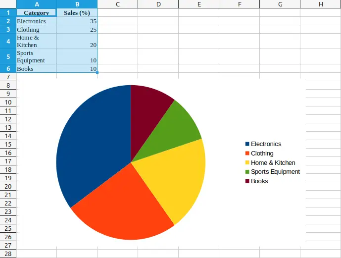
Steps to Generate a Pie Graph in LibreOffice Calc
The process in Calc begins with selecting your dataset and choosing the correct chart type from the Chart Wizard. The wizard guides you through each step while previewing your chart in real time, making it easier to adjust colors, slice labels, or display percentages. This guided workflow is ideal for users who want more control throughout the creation process.
- Enter data for categories and values.
- Select the range and click Insert → Chart.
- Choose Pie as the chart type.
- Click Finish, then right-click on the chart to edit labels, colors, or add a title.
You can generate a pie graph offline and export it in image or PDF format for reports or publications. The following image shows the data from the previous table used to generate a pie graph in LibreOffice Calc.
Creating Pie Charts in Excel
Excel remains one of the most widely used tools for data visualization, and its pie chart functionality is both powerful and polished. Excel offers numerous customization options, such as slice rotation, data callouts, and built-in color themes, that help you produce professional-quality graphics for reports or presentations.
Microsoft Excel offers one of the easiest ways to create a pie chart in Excel with just a few clicks.
Steps to Create a Pie Chart in Excel
When creating a pie chart in Excel, the key is preparing clean data where each category has a clearly defined name and value. Excel automatically pairs these columns to generate the initial chart, but from there, you can enhance readability with labels, legends, and formatting adjustments. The editing options are user-friendly and allow you to refine your chart without needing advanced skills.
- Enter your data – Place your categories in one column and corresponding values in the next.
- Select the data – Highlight both columns.
- Insert chart – Go to the Insert tab → click Pie Chart → choose a style (2D, 3D, or Doughnut).
- Customize – Add labels, change colors, or apply a title under Chart Tools.
You’ve just created a pie chart that can be resized, formatted, and exported for presentations.
Tips for Graphing: Creating Pie Charts
When building a pie chart, clarity should always be your top priority. Choosing a simple color palette, limiting the number of slices, and labeling percentage values helps viewers interpret your chart instantly. It’s also smart to position the largest slice at the top or to the right for better balance and readability.
Additionally, consider whether your data is suited to a pie chart at all. Pie charts work best for a small number of categories with noticeable differences in size. If your slices are extremely similar or numerous, a bar chart or stacked bar chart may communicate the information more effectively.
- Limit the number of slices: Too many categories make your chart hard to read. Aim for 5–7 slices.
- Use contrasting colors: Choose distinct colors to make each segment stand out.
- Label directly: Display category names and percentages inside or near slices.
- Avoid 3D effects: While they look appealing, they can distort data perception.
- Sort data: Arrange slices from largest to smallest for easier comparison.
Did You Know About Creating Pie Charts?
The pie chart was popularized by Scottish engineer William Playfair in 1801. He also invented bar and line charts. Interestingly, pie charts were once drawn manually with compasses before software automated the process.
Modern software often includes specialized variations of the traditional pie chart, such as exploded pies, donut charts, and multi-level (or “sunburst”) pies. These alternatives allow you to show additional layers of information while retaining the familiar circular form.
Another fun fact: research shows that people tend to overestimate angles and underestimate small slices, which is why proper labeling is crucial to prevent misinterpretation.
Common Mistakes When Graphing Creating Pie Charts
One of the most frequent mistakes is using too many slices, which creates a cluttered and confusing graphic. Pie charts communicate best when the differences between categories are obvious, so including a long list of small, nearly identical values can overwhelm viewers.
Another issue arises when chart creators rely on color alone to differentiate slices. Without labels or percentages displayed directly on the chart, readers may struggle to match slice colors with legend entries, especially if shades are similar. Ensuring proper labeling greatly improves readability.
- Using unequal totals: Always ensure your data adds up to 100%.
- Too many small slices: Combine minor categories into “Other” to keep charts clean.
- Inconsistent labeling: Always include a clear title and data source.
- Color overload: Avoid using overly bright or similar shades that confuse the reader.
Related Graph Types to Explore
If you find that a pie chart doesn’t communicate your data effectively, several related graph types can offer clearer insights. A donut chart, for example, functions like a pie chart but provides extra space in the center for labels or total values, improving readability.
You can also explore bar charts or stacked bar charts, which make it easier to compare category sizes side-by-side. For hierarchical or multi-level data, sunburst diagrams provide a layered circular layout that extends the pie chart concept while revealing how subcategories fit into the whole.
If you enjoy working with visual data, you may also like these tutorials:
Creating Bar Graphs – Compare categories side by side.
Making a Bar Chart for Beginners – Make a bar chart step by step.
Frequently Asked Questions About Creating Pie Charts
How can I make a pie chart free?
You can use Google Sheets or LibreOffice Calc to make a pie chart free of charge without needing paid software.
What’s the difference between a pie chart and a circle graph?
They’re the same thing, “circle graph” is just another name for a pie chart.
Can I make a pie chart online free without installing software?
Yes. Websites like Google Sheets and other online chart generators allow you to make a pie chart online free directly in your browser.
What’s the best program to create a pie chart?
Microsoft Excel, Google Sheets, and LibreOffice Calc all make excellent tools for creating pie charts. Choose one based on your budget and needs.
How do I customize colors in a pie chart?
Most programs let you click on each slice to change its color, or use built-in themes for consistent styling.
Conclusion on Creating Pie Charts
Learning about creating pie charts helps you turn raw data into clear, visual insights. Whether you use Excel, Google Sheets, or LibreOffice Calc, you can easily make your own pie chart or generate a pie graph to show proportions in your data. With the right colors, labels, and layout, your charts will communicate your message effectively.
For more graph tutorials, see the How to Create Graphs category.