A stacked bar chart is a popular data visualization tool used to compare parts of a whole across multiple categories. They help you see how sub-groups contribute to an overall total and are often used in business reports, presentations, and dashboards. In this guide, you learn what a stacked bar chart is, how to read and create one, and when it’s the best chart type to use.
Table of Contents
What Is a Stacked Bar Chart?
A stacked bar chart displays bars divided into segments that represent different sub-categories. Each bar shows the total for a main category, while the segments illustrate the contribution of individual components.
Instead of placing bars side by side (as in a grouped bar chart), stacked bars place them on top of each other (for vertical charts) or next to each other (for horizontal charts). This makes it easier to compare total values across categories while also showing how each segment contributes.
When to Use a Stacked Bar Chart
Stacked bar charts are particularly useful when you want to present both totals and the contribution of individual components at the same time. They allow viewers to quickly see the overall size of each category while also understanding how each sub-category adds to the total. This dual insight is valuable for comparing performance across groups, tracking progress over time, or highlighting the proportion of different segments within a dataset. For example, a business can use stacked bars to show total sales for each month while also displaying how each product contributes to the overall revenue.
Stacked charts are ideal when:
- You want to compare totals across categories.
- You need to see how individual parts contribute to a total.
- You’re displaying data over time with multiple sub-groups.
Common use cases include:
- Sales data by region and product category.
- Budget allocations across departments and years.
- Survey responses broken down by demographics.
Types of Stacked Bar Charts
Stacked bar charts come in two main forms, each with its own purpose and advantages. Understanding these types helps you choose the right visualization for your data. The two main types of stacked charts are as follows.
1. Standard Stacked Bar Chart
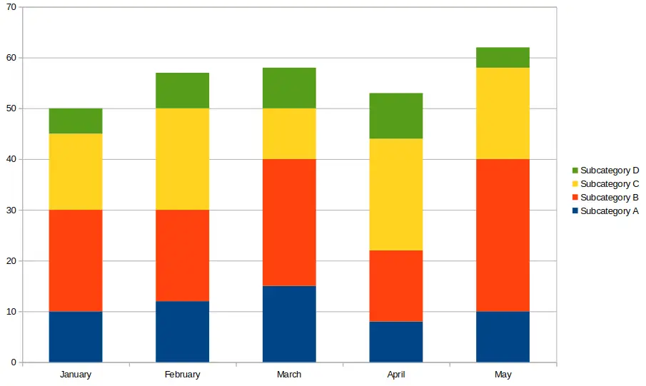
In a standard stacked bar chart, each bar represents the total value of a category, and the segments within the bar represent sub-category values. This type makes it easy to compare both the total amounts and the individual contributions of each segment. For instance, if you are tracking monthly sales of different products, the total bar height shows the overall sales, while each segment illustrates how much each product contributes. This format is ideal for datasets where the absolute values of segments are meaningful and you want a clear view of the total and parts simultaneously.
Each bar shows a total value broken into segments. Great for seeing total and sub-category values. See the image above near the top of this article for an example of this type of chart.
2. 100% Stacked Bar Chart
A 100% stacked bar chart scales all bars to the same height, representing 100% of the category. Each segment shows the percentage contribution of its sub-category rather than the absolute value. This is particularly useful when comparing proportions across different categories, such as market share, survey results, or budget allocations. Even if total values vary widely, the relative proportions are immediately visible, allowing viewers to focus on composition rather than absolute amounts.
All bars are scaled to the same height (100%), and segments show percentages. Best for comparing proportions across categories. The image below shows an example of a 100% stacked bar chart, also called a percent stacked bar chart.

How to Create a Stacked Bar Chart (Step-by-Step)
Creating a stacked bar chart is straightforward with modern spreadsheet tools and data visualization platforms. The process begins with organizing your data into categories and sub-categories, ensuring each is clearly labeled. Once the data is structured, you can select the chart type and customize colors, labels, and titles to improve readability. This step-by-step approach ensures that both totals and sub-category contributions are clearly represented, making your chart easy to interpret.
You can create a bar chart of the stacked type using spreadsheet tools like Excel, Google Sheets, or data visualization platforms.
Example Data
The example dataset shows monthly sales for three products: Product A, Product B, and Product C. This simple dataset illustrates how each product contributes to the total sales each month. By arranging the data in columns with clear headers, you create a foundation that makes generating a stacked bar chart simple. Observing these numbers in a chart allows you to see trends, such as which products are growing or shrinking in proportion to the total, and quickly spot seasonal patterns or anomalies.
| Month | Product A | Product B | Product C |
|---|---|---|---|
| Jan | 30 | 20 | 10 |
| Feb | 40 | 25 | 15 |
| Mar | 35 | 30 | 20 |
Steps in Excel or Google Sheets
After entering your data, select the full range including headers and navigate to Insert → Chart. Choose the stacked bar chart type and adjust settings like axis labels, colors, and chart titles for clarity. You can also add data labels to each segment to show precise values or percentages. These steps ensure your chart is not only visually appealing but also communicates the insights clearly to your audience. Fine-tuning colors and sorting categories consistently can make comparisons easier and highlight trends effectively.
- Enter your data with categories and sub-categories in columns.
- Select the full dataset including headers.
- Go to Insert > Chart and choose Stacked Bar Chart.
- Adjust chart labels, titles, and colors for clarity.
The following image shows the above example created in Google Sheets.

Stacked Example Bar Chart
Stacked bar charts help you track multiple related data points simultaneously. For example, monitoring three product lines over several months allows you to see both overall monthly totals and individual product contributions. You may notice that while total sales increase, one product’s proportion may shrink while another grows, indicating shifting trends.
Stacked bars are also helpful for comparing survey responses across demographic groups or budget allocations across departments. By providing both the big picture and detailed breakdowns, stacked charts make complex datasets easier to understand at a glance.
Tips for Better Stacked Charts
To improve readability and interpretability, use contrasting colors for each segment and limit the number of sub-categories to avoid clutter. Consistent ordering and labeling help viewers follow trends and understand relationships between segments. Adding total labels at the top of each bar provides quick context, while segment labels offer detailed insight into individual contributions. Additionally, consider grouping smaller segments into an “Other” category to maintain clarity when there are many sub-categories.
- Use contrasting colors for clarity between segments.
- Limit the number of segments to avoid clutter.
- Add data labels to show exact values or percentages.
- Sort categories consistently to help users compare data.
Limitations of Bar Charts that are Stacked
While stacked bar charts can effectively show totals and sub-category contributions, they are not always the best choice for every dataset. Certain situations can make them harder to read or interpret, especially when precision or clarity is essential. Understanding these limitations helps you decide when a different chart type might be more appropriate.
When there are too many segments, precise comparisons between individual sub-categories are needed, or segment values are very small or similar in size, stacked bar charts can become confusing. In those cases, consider using a grouped bar chart or line chart instead.
While stacked bar charts are powerful, they can become difficult to read when:
- There are too many segments.
- You need precise comparisons between individual sub-categories.
- Segment values are very small or similar in size.
In those cases, consider using a grouped bar chart or line chart instead.
Frequently Asked Questions (FAQ)
What’s the difference between a stacked and a grouped bar chart?
A stacked bar chart combines all sub-categories into a single bar per main category, showing both totals and contributions. A grouped (clustered) bar chart displays each sub-category as a separate bar side by side, making it easier to compare individual sub-category values across categories but less clear on totals.
Can I use percentages in a stacked chart?
Yes. A 100% stacked bar chart shows the relative proportion of each sub-category as a percentage of the total. This is particularly useful for comparing compositions across categories, regardless of differences in absolute totals.
Are stacked charts good for time-series data?
Absolutely. Stacked charts are commonly used to track changes over time while displaying sub-group contributions. For instance, they are ideal for showing monthly sales breakdowns, website traffic by source, or budget allocations across periods. However, if precise comparisons between non-bottom segments are needed, a grouped chart may provide clearer insights.
How many segments should I include in a stacked bar chart?
For clarity, aim for three to five segments per bar. Too many segments can make the chart difficult to read and interpret. If you have numerous categories, consider grouping smaller ones into an “Other” category or using multiple charts to maintain readability.
Can stacked bar charts mislead viewers?
They can if the segments are too small, too numerous, or if colors and labels are not used consistently. Always label data clearly, maintain consistent color coding, and consider chart alternatives if comparisons between sub-categories are critical.
What tools can I use to create stacked bar charts?
Excel, Google Sheets, and platforms like Tableau, Power BI, or Google Data Studio all support stacked bar charts. Each tool allows customization of colors, labels, and sorting, helping you create clear and visually appealing charts for presentations or reports.
Conclusion
A stacked bar chart is an effective way to visualize parts of a whole across multiple categories. Whether you’re working with sales data, survey responses, or project budgets, this chart type helps you communicate both total and sub-group values clearly. Just remember to keep the number of segments manageable and label your data for maximum readability.
Use tools like Excel or Google Sheets to create your first chart of this type and gain better insights into your data today.
You may also be interested in our other graph types and chart examples.