An Excel line graph is one of the most effective ways to visualize trends over time. Whether you’re tracking sales growth, temperature changes, or project progress, line graphs make patterns easy to see and understand.
In this tutorial, you’ll learn how to create a line graph in Excel, format it for clarity, and enhance it with features like trend lines and average lines.
Table of Contents
- What Is an Excel Line Graph?
- How to Create a Line Graph in Excel
- How to Customize an Excel Line Graph
- How to Add a Trend Line in Excel
- Example: Adding a Trend Line to a Chart in Excel
- How to Add an Average Line to an Excel Chart
- Excel Line Graph Tips for Graphing
- Excel Line Graph: Did You Know?
- Excel Line Graph Common Mistakes
- Excel Line Graph Frequently Asked Questions
- How do I create a line graph in Excel?
- Can I create a line chart in Excel with multiple series?
- How do I make a line chart in Excel that shows trends?
- How do I add an average line to an Excel chart?
- Can I remove Excel grid lines from my chart?
- What’s the difference between a line graph and a scatter plot in Excel?
- Can I use trend lines in Excel for forecasting?
- Related Graph Types to Explore
- Excel Line Graph Conclusion
What Is an Excel Line Graph?
A line graph in Excel is a powerful visual tool that connects individual data points using straight lines to show trends over time or across categories. Unlike bar or column charts, which emphasize discrete values, line graphs emphasize the progression and relationships between data points, making it easier to identify patterns, fluctuations, and trends in your dataset. Whether tracking sales growth, temperature changes, or website traffic, a line graph provides a clear snapshot of how your data evolves.
An Excel line graph displays data points connected by straight lines. It’s especially useful for showing how values change over time or in response to another variable. Each line can represent a series—such as different products, months, or categories—making it ideal for comparing trends visually.
Common uses include:
- Monthly sales performance
- Year-over-year comparisons
- Scientific or experimental data tracking
How to Create a Line Graph in Excel
Creating a line graph in Excel begins with organizing your data in a way that Excel can interpret correctly, typically, this means having one column for your categories (like dates or labels) and one or more columns for the values you want to track. Once your data is structured, Excel’s built-in chart tools allow you to quickly generate a line graph that visually represents your information, offering an immediate way to analyze trends at a glance.
Creating a line graph in Excel is simple once you know where to start. Follow these steps to make your chart from raw data.
Step 1: Enter Your Excel Line Graph Data
Organize your data in two columns, one for categories (like months) and one for values. In the following example data table, sales are plotted over months. As a result, months are put in one column with the sales from each month in a second column.
| Month | Sales ($) |
|---|---|
| Jan | 1500 |
| Feb | 1800 |
| Mar | 2100 |
| Apr | 2600 |
| May | 2900 |
Step 2: Insert the Excel Line Graph Chart
- Highlight the data range.
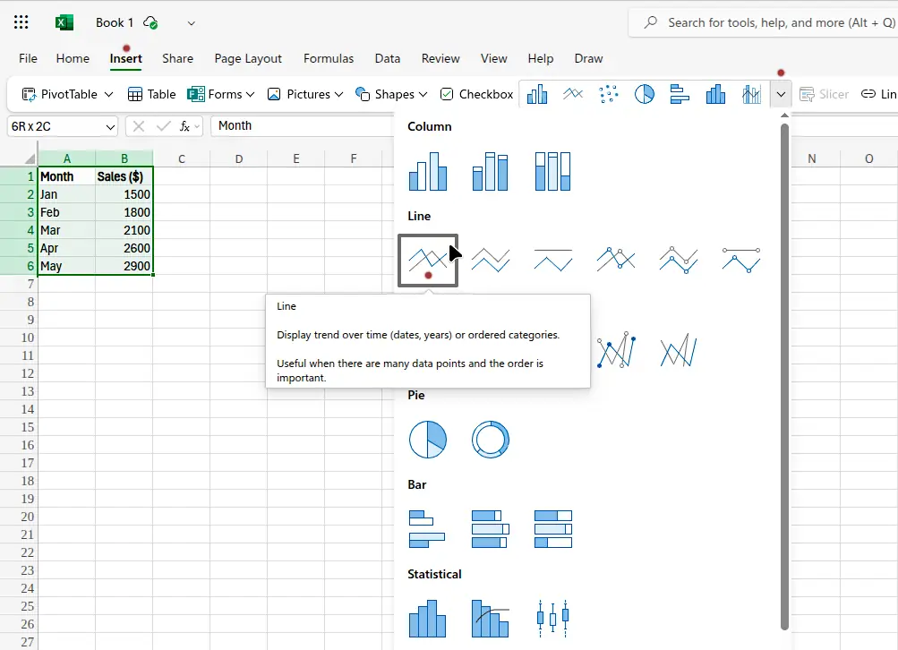
- Go to Insert → Charts → Line → 2D Line. Alternately, select Insert and then click the Insert Chart drop-down box. Finally click the line graph in the Line section of the menu, as shown in the following image.
- Excel will generate a basic line chart automatically.
You’ve now successfully made a line chart in Excel that shows how your data progresses. The following image shows the finished chart.

How to Customize an Excel Line Graph
Customizing your Excel line graph allows you to make your data visually compelling and easier to interpret. You can adjust the color, line style, marker symbols, and axes labels to highlight important points or trends. Beyond aesthetics, customization ensures that your chart communicates the right story to your audience and emphasizes the most relevant data insights.
Once your chart is created, customize it for clarity and presentation.
You can:
- Change colors or styles for each line.
- Modify axis titles and chart title.
- Adjust Excel grid lines for readability.
To modify Excel grid lines, click on the chart. As a result, the toolbar menu shows a Gridlines item. Click this item for options to edit the horizontal and vertical grid lines.
With the chart selected, click the Format item on the toolbar menu. As a result, a pane opens at the right of the window. Expand either the Horizontal Axis item, or the Vertical Axis item in this pane. Change grid line colors here. For example, with Major Guidelines enabled, expand this item and then select Outline. Options to change color, weight, and dashes appear for the selected grid lines.
How to Add a Trend Line in Excel
A trend line in Excel is a useful analytical tool that helps visualize the overall direction or pattern of your data, even when individual points fluctuate. Adding a trend line can reveal whether your data is trending upward, downward, or remaining consistent over time. It’s particularly helpful for forecasting and understanding long-term trends.
Adding a trend line helps reveal the overall direction of your data, whether it’s increasing, decreasing, or stable.
Step 1: Select the Data Series
Click on a point on the graph or chart representing your data to select it.
Step 2: Add the Trend Line
Right-click and choose Add Trendline
Step 3: Customize Your Trend Line
Right-click the trend line. Select Format on the menu that pops up. Choose between linear, exponential, or moving average trend types under Trend Type in the right pane.
The trend line in Excel helps make long-term patterns more visible, especially when working with large data sets.
Example: Adding a Trend Line to a Chart in Excel
To see the impact of a trend line, it’s helpful to work with a real example. By adding a trend line to an existing line graph, you can quickly observe the general trajectory of your dataset, identify potential outliers, and make more informed decisions based on the pattern the trend line reveals.
Let’s say you have monthly sales data for a small online shop, as shown in the following table. You want to visualize whether sales are increasing over time.
| Month | Sales ($) |
|---|---|
| January | 420 |
| February | 460 |
| March | 480 |
| April | 530 |
| May | 550 |
| June | 600 |
| July | 640 |
| August | 670 |
| September | 710 |
| October | 760 |
| November | 790 |
| December | 830 |
Step-by-Step: How to Add a Trend Line
Before diving into the steps, it’s important to ensure that your chart is ready for a trend line. Your data should be organized clearly, and your chart type should support trend lines, such as a line or scatter chart. Understanding these prerequisites ensures that the trend line you add accurately represents the underlying data.
1. Create the chart
- Select the data range (
A1:B13in this example). - Go to Insert → Insert Chart → Scatter with Only Markers. See the following image for details.
- You’ll now see a simple chart of sales over months, shown in the second image below.

Excel inserts the scatter plot chart as the following image shows, which plots the selected data. It is now ready for us to add the trend line.

2. Add the trend line
- Click on a data point in the chart to select the data series.
- Right-click on one of the data points and choose Add Trendline from the pop-up menu.
- In the Format Trendline panel that appears:
- Choose Linear (the most common option, which may automatically be selected already).
- Optionally right-click the trend line and then click Add Trendline Equation on the pop-up menu.
3. Customize the trend line
- Click the trend line and the right pane shows formatting options. Change the color or style under Outline option to make it stand out.
- Rename it (e.g., “Sales Growth Trend”) using the Chart Title item on the top toolbar.
Result
Once the trend line is added, Excel instantly overlays it on your chart, providing a clear visual reference for your data’s general direction. You can immediately see whether the trend is positive, negative, or neutral, and how it compares to individual data points.
For this example, you’ll see a smooth line cutting through your sales data, showing a steady upward trend over the year, confirming that your shop’s sales are increasing month by month. The finished and formatted trend line is show in the image below.

Excel Line Graph Tip
Using line graphs effectively often requires attention to small details, such as choosing the right scale for your axes, adding data labels, or highlighting key points. These tips can significantly improve readability and make your charts more insightful for presentations or reports.
If your data grows faster or slower over time, experiment with Exponential or Polynomial trend lines for a more accurate fit.
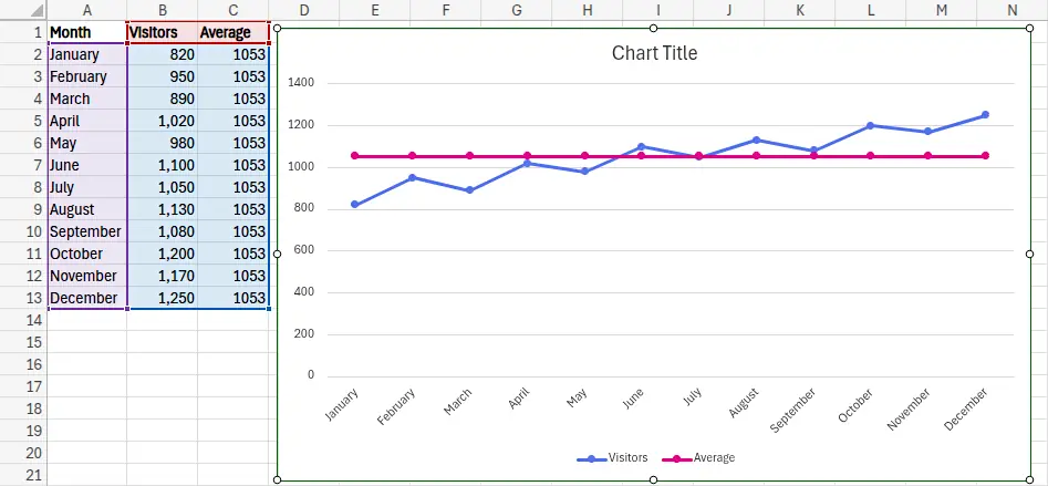
How to Add an Average Line to an Excel Chart
Adding an average line helps you instantly compare each data point to the overall mean. It’s a useful way to highlight performance above or below average, especially in line or bar charts. Let’s go through a step-by-step example showing how to add an average line to an Excel chart.
Sample Data: Monthly Website Visitors
The following example data is used in the steps that follow. Insert this data into an Excel spreadsheet.
| Month | Visitors |
|---|---|
| January | 820 |
| February | 950 |
| March | 890 |
| April | 1,020 |
| May | 980 |
| June | 1,100 |
| July | 1,050 |
| August | 1,130 |
| September | 1,080 |
| October | 1,200 |
| November | 1,170 |
| December | 1,250 |
Step 1: Calculate the average
- In a new cell, enter:
=AVERAGE(B2:B13)Suppose this gives you an average of 1,053 visitors.
- Create a new column labeled Average and fill every row with the same value (
1,053).
| Month | Visitors | Average |
|---|---|---|
| January | 820 | 1053 |
| February | 950 | 1053 |
| March | 890 | 1053 |
| … | … | … |
| December | 1250 | 1053 |
Step 2: Create the chart
- Select the range A1:C13.
- Go to Insert → Insert Chart → Line with Markers.
- You’ll now see a line graph of monthly visitors with an average line, as the image below shows.
Step 3: Format the average line
- Right-click the new line and choose Format on the pop-up menu.
- Change the line color (e.g., red or gray).
- Set Dash Type to Long Dash to make it stand out.
- Rename it in the legend to “Average Line”.
- Remove markers from the line.
You now have a line graph showing monthly visitor data, with a clear horizontal line marking the average.
This makes it easy to see which months performed above or below average, as the following image shows.

Excel Line Graph Tip
You can combine this technique with a trend line in Excel to show both the long-term growth pattern and the benchmark average, giving your chart more analytical depth.
Excel Line Graph Tips for Graphing
To maximize the usefulness of line graphs in Excel, consider several best practices: keep your data organized, avoid cluttering the chart with too many lines, and use markers sparingly to emphasize critical points. Additionally, pairing line graphs with clear titles and axis labels ensures your audience can quickly interpret the trends being presented.
Follow these best practices for making clear, accurate, and professional-looking graphs:
- Label axes clearly: Indicate units and categories.
- Use contrasting colors: Helps differentiate multiple data series.
- Minimize clutter: Too many Excel grid lines or labels can distract viewers.
- Highlight trends: Always include a trend line in Excel for data with visible direction.
- Keep data up-to-date: Dynamic charts linked to tables ensure automatic updates.
Excel Line Graph: Did You Know?
The line graph concept dates back to the 18th century, but Microsoft Excel made it mainstream in the 1980s. Today, the Excel line graph remains one of the most widely used chart types for data analysis, from finance to scientific research, because it balances simplicity and information density perfectly.
Line graphs have been a staple of data visualization for centuries, dating back to the early 18th century when William Playfair first used them to represent economic data. In Excel, line graphs are not just limited to simple trends, they can also include multiple series, secondary axes, and even error bars for more complex data analysis.
Another interesting feature is that Excel allows you to create dynamic line graphs using tables or named ranges. This means that as your underlying data updates, the chart updates automatically, making it ideal for dashboards and real-time reporting.
You can also combine line graphs with other chart types, like columns or areas, to create combination charts. This is particularly useful when you want to compare different types of data on a single chart while keeping the visual representation clear and intuitive.
Excel Line Graph Common Mistakes
One common mistake when creating line graphs is plotting non-sequential or unrelated categories along the X-axis, which can distort the trend and confuse viewers. Another frequent issue is including too many data series in a single chart, which can make it difficult to distinguish individual trends. Proper data preparation and careful chart design help avoid these pitfalls.
Even though line graphs are simple, beginners often make avoidable mistakes:
- Using too many series: Overlapping lines make data hard to read.
- Uneven data intervals: Missing or irregular x-values distort trends.
- Incorrect scaling: Can exaggerate or hide actual changes.
- Forgetting to label: Unlabeled axes leave viewers guessing.
Avoiding these ensures your Excel line graph communicates information clearly.
Excel Line Graph Frequently Asked Questions
How do I create a line graph in Excel?
Highlight your data, go to Insert → Insert Chart → Line, and choose the type of line chart you want. You can then format it as needed.
Can I create a line chart in Excel with multiple series?
Yes. Add more data columns, then reselect your data range or use “Select Data” to include additional series.
How do I make a line chart in Excel that shows trends?
Add a trend line in Excel using by right-clicking the graph and then selecting Add Trendline from the pop-up menu. Choose the type of trend that fits your data.
How do I add an average line to an Excel chart?
Calculate the average value, add it as a new series, and format it as a horizontal reference line.
Can I remove Excel grid lines from my chart?
Yes, right-click the grid lines and choose “Delete” or “Format Gridlines” to hide or adjust them.
What’s the difference between a line graph and a scatter plot in Excel?
Line graphs connect data points in order, ideal for time-based data. Scatter plots show relationships between two numerical variables.
Can I use trend lines in Excel for forecasting?
Yes, Excel’s trend lines can extend into the future. Enable “Forecast” in the trend line options to project future values.
Related Graph Types to Explore
While line graphs are excellent for showing trends, other chart types can complement them depending on your data. For example, area charts are similar but emphasize the magnitude of change, while scatter plots provide more precise visualization of relationships between two variables. Exploring these alternatives can help you select the most effective way to communicate your data story.
If you found this guide helpful, you might also like:
- Excel Bar Graphs – Great for comparing discrete values.
- Scatter Plots in Excel – Perfect for correlation and relationship analysis.
- Excel Area Charts – Ideal for showing cumulative trends.
Excel Line Graph Conclusion
An Excel line graph is a powerful visualization for showing trends and comparing data over time. By learning how to create a line graph in Excel, format Excel grid lines, and add a trend line or average line, you can make your charts both professional and informative. With these techniques, your Excel visualizations will communicate insights clearly and effectively every time.
For more graph types, see our article on common types of graphs.