In this guide, we walk you through the most common types of graphs, what they’re used for, and how to decide which one best fits your data. At the end of this guide, we list 20 additional more specialized graphs and their common uses. This covers a total of 32 different types of graphs.
Table of Contents
12 Common Types of Graphs and Their Uses
Graphs are powerful tools for visualizing data, identifying trends, and communicating information clearly. But with so many different chart types available, choosing the right one can be overwhelming. 12 common types of graphs follow below, with more details and an image of each graph.
1. Bar Graph
Bar graphs are one of the most straightforward ways to compare different categories or groups. They use rectangular bars to represent values, making it easy to see which categories are larger or smaller at a glance.
Beyond simple comparisons, bar graphs can also highlight trends when arranged in a specific order, such as from highest to lowest. They are versatile enough to display both discrete and grouped data, allowing for comparisons across multiple sets simultaneously.
Best for: These types of graphs are best for comparing quantities across different categories.
Bar graphs use rectangular bars to represent data values. They can be displayed vertically or horizontally.
Example use: Comparing sales figures for multiple products.
See our article on making a bar chart for beginners to see how you can make one of these graphs in Excel or Google Sheets.

2. Line Graph
Line graphs are excellent for showing how data changes over time, connecting points with straight lines to reveal trends and patterns. This visual approach makes it simple to spot increases, decreases, or periods of stability.
They are particularly useful for observing relationships in continuous data, such as temperature fluctuations, stock prices, or population growth. Multiple lines can be overlaid to compare different variables across the same timeline, providing deeper insights into correlations and differences.
Best for: Showing trends over time.
Line graphs connect data points with a line, making them ideal for continuous data like monthly temperatures or stock prices.
Example use: Tracking website traffic over several months.
See our article on how to make an Excel line graph to learn how to create a line graph in Excel.

3. Pie Chart
Pie charts display data as slices of a circle, representing proportions of a whole. Each slice shows the relative size of a category, making it easy to see which parts dominate or contribute the least.
They are most effective for highlighting composition rather than exact values. Using contrasting colors and clear labels can enhance readability, allowing viewers to quickly grasp the balance of contributions across categories.
Best for: Showing proportions or percentages of a whole.
Pie charts display data as slices of a circle. Each slice represents a category’s contribution to the total.
Example use: Visualizing how a budget is divided across departments.
See our article on creating pie charts with instructions for both online, offline and free options.

4. Histogram
Histograms are similar to bar graphs but are specifically designed to show the distribution of numerical data. Each bar represents a range of values, making it easy to see where data clusters or spreads out.
They are essential for identifying patterns such as skewness, symmetry, or outliers. Histograms are widely used in statistics and data analysis to assess the shape of a dataset and understand underlying trends.
Best for: Showing frequency distributions of continuous data.
Histograms look like bar graphs but are used to display data grouped into ranges (bins), such as test scores or age groups. For a more in-depth explanation, see the histogram chart article.
Example use: Analyzing height distribution in a population.

5. Scatter Plot
Scatter plots display individual data points along two axes, allowing you to explore relationships between variables. Each point represents a single observation, making patterns and correlations visible at a glance.
They are particularly useful for identifying trends, clusters, or anomalies in data. Adding a trend line or using different symbols for categories can enhance interpretation and reveal insights about the strength or direction of relationships.
Best for: Exploring relationships or correlations between two variables.
Each point on a scatter plot represents a data pair. It’s useful for identifying patterns or trends.
Example use: Plotting hours studied vs exam scores. See the scatter chart tutorial for more examples of the scatter plot graph.

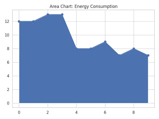
6. Area Chart
Area charts are similar to line graphs but shade the area beneath the line to emphasize magnitude. This visual approach highlights cumulative totals or relative contributions over time.
They are ideal for showing how parts of a whole change collectively, such as revenue breakdowns or resource usage. Layering multiple areas can provide a clear comparison of contributions while maintaining a sense of overall growth or decline.
Best for: Visualizing part-to-whole relationships over time.
Similar to a line graph, but the area beneath the line is filled in. It’s great for stacking multiple data series. See our area chart article that explains area charts in detail, their different variations, and has instructions on how to make one of these graphs.
Example use: Tracking energy consumption from different sources.
7. Stacked Bar Chart
Stacked bar charts build on regular bar graphs by dividing each bar into segments, representing subcategories of the total. This allows viewers to compare both the overall size and the internal composition of each category.
They are especially useful for illustrating changes over time or comparing multiple groups in one view. By using contrasting colors and consistent ordering, stacked bars can reveal trends in both totals and parts simultaneously.
Best for: Comparing parts of a whole across different categories.
Each bar is split into sections that represent subcategories, stacked on top of each other.
Example use: Showing revenue breakdowns by product and region.
See our stacked bar chart article that gives more details on how to create one of these types of graphs.

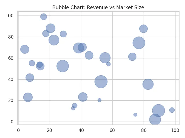
8. Bubble Chart
Bubble charts take scatter plots a step further by using the size of each bubble to represent an additional variable. This enables three-dimensional data comparisons in a two-dimensional space.
They are particularly effective for visualizing relationships among three variables, such as sales, profit, and market share. Color coding or labeling bubbles can further enhance clarity and highlight important patterns or outliers.
Best for: Adding a third dimension to scatter plots.
Each point has a size in addition to X and Y values. It’s useful for showing relationships with three variables.
Example use: Comparing company size, revenue, and market growth.
See the bubble chart article for additional details and more examples of this type of chart.
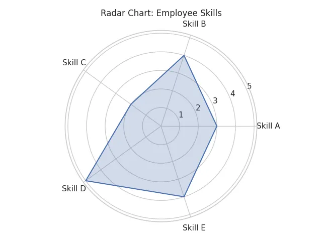
9. Radar (Spider) Chart
Radar charts, also called spider charts, plot multiple variables on axes that radiate from a central point. This creates a web-like shape that shows how each variable compares relative to the others.
They are ideal for performance analysis, skill assessment, or any situation where multiple metrics need to be evaluated simultaneously. By overlaying multiple datasets, radar charts can visually compare strengths and weaknesses across different categories.
Best for: Comparing multiple variables across categories.
Values are plotted on axes from a central point, creating a web-like shape.
Example use: Visualizing employee skill levels across competencies.
For many more details on these types of graphs, see our spider graph explained article.
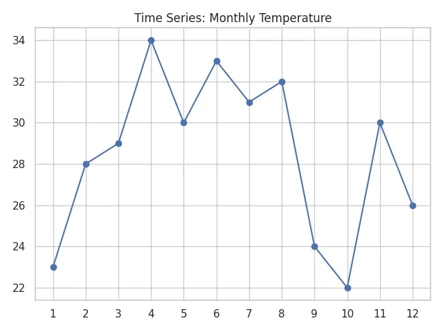
10. Time Series Graph
Time series graphs track how data points change over time, revealing trends, cycles, and patterns. They are particularly valuable for forecasting and analyzing temporal behaviors.
These graphs are widely used in finance, climate studies, and production monitoring. Highlighting specific events or seasonal patterns can provide deeper insights and help interpret fluctuations that may otherwise seem random.
Best for: Tracking changes in data over time.
Often uses line graphs, area charts, or bar graphs to visualize trends.
Example use: Showing temperature changes throughout the year.
11. Box Plot (Box-and-Whisker Plot)
Box plots summarize the distribution of a dataset using five key statistics: minimum, first quartile, median, third quartile, and maximum. This provides a concise snapshot of variability and central tendency.
They are especially useful for detecting outliers and comparing distributions across multiple groups. The visual emphasis on the interquartile range helps quickly identify the spread and symmetry of data, making box plots a staple in statistical analysis.
Best for: Displaying distribution, median, and outliers in a dataset.
Box plots are great for comparing multiple groups and understanding data spread.
Example use: Analyzing exam scores across classrooms.

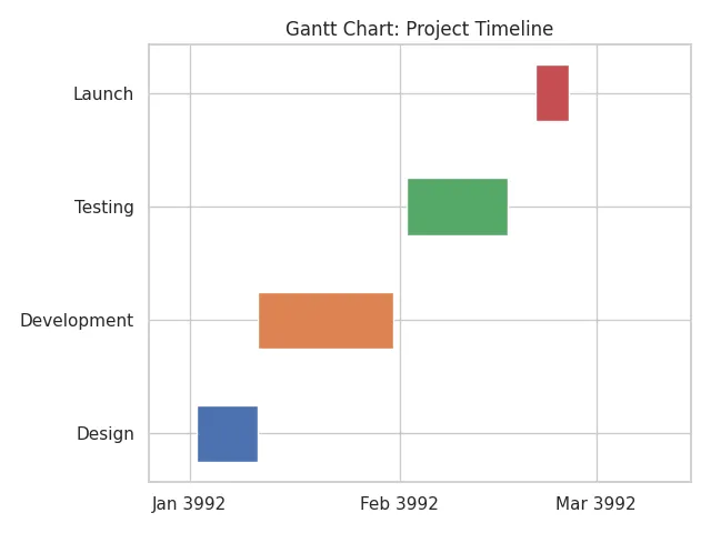
12. Gantt Chart
Gantt charts are a cornerstone of project management, visually representing tasks along a timeline. Each bar shows the start and end dates of a task, helping teams track progress and deadlines.
They are particularly effective for planning complex projects with interdependent tasks. Adding milestones, dependencies, and color-coded progress indicators allows project managers to identify bottlenecks and optimize workflow efficiently.
Best for: Project planning and task scheduling.
Gantt charts show tasks, durations, and dependencies over time.
Example use: Managing a website development timeline.
Choosing the Right Types of Graphs
Selecting the right type of graph is more than just a design choice, it determines how clearly your data will be understood. The type of graph you choose should align with the kind of data you have, the story you want to tell, and how your audience will interpret it. Using the wrong graph can lead to confusion or misinterpretation, even if your data is accurate.
Consider the context of your data: categorical data often benefits from bar or column charts, numerical trends over time are best shown with line or area graphs, and proportions are most clearly communicated with pie, donut, or stacked bar charts. Understanding these distinctions ensures your visualization not only looks polished but also delivers actionable insights.
Choosing the right graph depends on:
- Data type: Is your data categorical, numerical, or time-based?
- Purpose: Are you comparing, showing trends, or breaking down parts of a whole?
- Audience: Will your readers understand more complex graphs like box plots or radar charts?
Here’s a quick summary of all of the types of graphs covered in this article:
| Graph Type | Best For |
|---|---|
| Bar Chart | Comparing quantities across different categories |
| Line Graph | Showing trends over time |
| Pie Chart | Showing proportions or percentages of a whole |
| Histogram | Showing frequency distributions of continuous data |
| Scatter Plot | Exploring relationships or correlations between two variables |
| Area Chart | Visualizing part-to-whole relationships over time |
| Stacked Bar Chart | Comparing parts of a whole across different categories |
| Bubble Chart | Showing relationships with three variables (X, Y, and size) |
| Radar (Spider) Chart | Comparing multiple variables across categories |
| Time Series Graph | Tracking changes in data over time |
| Box Plot (Box-and-Whisker Plot) | Displaying distribution, median, and outliers |
| Gantt Chart | Project planning and task scheduling |
20 Additional Types of Graphs
While this post focused on 12 of the most common graph types used in everyday data visualization, there are many other types of graphs designed for more specialized use cases. These additional graphs can help you explore complex data, visualize relationships, track performance, or present information in unique ways depending on the field or context. Below is a list of 20 other graph types you might encounter or want to explore for more advanced data storytelling.
| Graph Type | Best For |
|---|---|
| Waterfall Chart | Showing incremental changes (e.g., profit/loss over time) |
| Heat Map | Visualizing data density or correlation in a matrix layout |
| Treemap | Representing hierarchical data as nested rectangles |
| Sunburst Chart | Visualizing hierarchies in a radial layout |
| Polar Area Chart (Coxcomb) | Showing cyclical data like wind directions or seasons |
| Donut Chart | A pie chart variant with a blank center |
| Mekko Chart (Marimekko) | Visualizing two variables with varying widths and heights |
| Funnel Chart | Visualizing steps in a process (e.g., sales funnel) |
| Bullet Chart | Displaying performance against a goal |
| Sankey Diagram | Visualizing flow and volume between stages |
| Dot Plot | Comparing frequencies or values with dots |
| Violin Plot | Showing distribution with density curves |
| Parallel Coordinates Plot | Comparing multiple variables for multivariate data |
| Network Graph | Visualizing relationships between nodes |
| Candlestick Chart | Analyzing price movements in financial markets |
| OHLC Chart | Showing Open, High, Low, and Close in financial data |
| Gauge Chart | Showing progress toward a goal like a speedometer |
| Control Chart | Monitoring quality and detecting out-of-control processes |
| Pareto Chart | Highlighting the most significant factors in a dataset |
| Step Line Chart | Showing changes at irregular intervals |
Types of Graphs Used in Different Fields
Data visualization needs vary across different fields, and choosing the right type of graph can make complex information easier to understand. While many graphs are versatile, certain types are particularly suited to the demands of specific industries or disciplines. Using graphs that align with the standard practices of a field can improve clarity, support decision-making, and strengthen communication.
Different fields rely on specific types of graphs to communicate insights based on their unique data needs. Here’s how various industries apply common and specialized types of graphs:
Types of Graphs in Science
In scientific research, the focus is on precision, clarity, and reproducibility. Graphs in science are chosen not only to summarize data but also to reveal patterns, relationships, and anomalies that support experimental conclusions. Line graphs, scatter plots, histograms, and box plots are commonly used because they allow researchers to highlight trends, distributions, and correlations in a visually straightforward way.
These graphs are essential across biology, chemistry, physics, and environmental studies, helping scientists quickly interpret experimental results, identify outliers, and communicate findings in academic papers and reports. In many cases, the choice of graph can influence how convincingly data supports a hypothesis.
In scientific research, data must be visualized clearly and precisely. Commonly used types of graphs in science include:
- Line graphs for showing trends in experiments over time.
- Scatter plots to analyze relationships or correlations between variables.
- Histograms to display frequency distributions of measured data.
- Box plots for understanding statistical spread, medians, and outliers.
Scientific fields such as biology, chemistry, and environmental science rely heavily on these graphs for reporting and analysis.
Types of Graphs in Business and Marketing
In business and marketing, graphs are tools for storytelling and strategy. They help managers, analysts, and stakeholders quickly grasp performance metrics, market trends, or resource allocations. Bar graphs and stacked bar charts are often used to compare sales, expenses, or engagement across channels, while pie charts highlight proportions such as market share or budget breakdowns.
Specialized graphs like funnel charts and bullet charts allow businesses to visualize processes, track conversions, and measure performance against key goals. Using the right visual not only speeds decision-making but also ensures that strategic insights are clear to both technical and non-technical audiences.
Businesses and marketers use visual data to guide decisions and track performance. Popular types of graphs in business include:
- Bar graphs and stacked bar charts for comparing sales or marketing channels.
- Pie charts for illustrating budget allocations or market share.
- Funnel charts to visualize sales or customer conversion processes.
- Bullet charts to show progress against goals in dashboards.
These types of graphs help stakeholders quickly interpret key performance indicators (KPIs) and strategy outcomes.
Types of Graphs in Education and Research
Educators and academic researchers rely on graphs to make data accessible and enhance comprehension. Area charts, for instance, can demonstrate how different components contribute to a total over time, while radar charts are useful for comparing multidimensional performance, such as student scores across several subjects. Gantt charts assist in planning academic projects or coordinating curriculum timelines.
By presenting data visually, these graphs help students and researchers identify patterns, understand relationships, and engage in critical thinking. They are not just tools for analysis—they are also learning aids that make abstract or complex information more tangible.
In education, teachers and researchers use graphs to explain and analyze data with clarity. Useful types of graphs in these settings include:
- Area charts for visualizing part-to-whole relationships over time.
- Radar charts to compare student performance across subjects.
- Gantt charts to manage academic projects or curriculum planning.
Graph-based visuals enhance comprehension and critical thinking across all levels of learning.
Comparing Different Types of Graphs
When deciding between graph types, the most important consideration is what you want your audience to take away from the data. Each type of graph has strengths and limitations that make it better suited to specific analytical goals. Comparing categories, showing trends, and illustrating part-to-whole relationships all require different approaches to visualization.
Understanding these distinctions can save time, reduce misinterpretation, and ensure that your data communicates its intended story.
Choosing the most effective visual often comes down to what you want to communicate. Here’s how different types of graphs compare based on their function:
Which Types of Graphs Are Best for Comparing Categories?
Graphs designed for category comparison allow viewers to quickly see differences in magnitude across groups. Bar graphs and stacked bar charts are particularly effective because they provide a visual benchmark that makes disparities obvious at a glance.
Dot plots are another option, especially when you want to compare multiple values without overwhelming the viewer. They offer a clean, minimalist approach that highlights each category individually while maintaining an overall comparison context.
- Bar graphs and stacked bar charts are ideal for comparing amounts across categories.
- Dot plots can also provide a clear comparison of multiple values without visual clutter.
Which Types of Graphs Are Best for Showing Trends?
Trend-focused graphs help audiences follow how data changes over time or across sequential measurements. Line graphs and time series graphs are ideal because they clearly illustrate upward, downward, or cyclical movements.
Area charts can also emphasize cumulative trends or highlight the contribution of different components to a total over time. They are especially useful when comparing multiple series or when illustrating changes that accumulate to a whole.
- Line graphs and time series graphs are best for showing changes over time.
- Area charts can also be used to display cumulative trends.
These types of graphs are often used in financial, scientific, and web analytics data.
Which Types of Graphs Are Best for Showing Part-to-Whole Relationships?
Graphs that display part-to-whole relationships are designed to show how individual components contribute to a total. Pie charts, donut charts, and stacked bar charts provide clear visual cues about proportions, making it easy to interpret percentages at a glance.
Treemaps and sunburst charts are better for larger, hierarchical datasets where multiple layers of parts need to be represented. These visualizations allow audiences to see both the overall distribution and the structure within the total.
- Pie charts, donut charts, and stacked bar charts work well when you need to show how a total is divided.
- Treemaps and sunburst charts are better for large hierarchical part-to-whole comparisons.
Understanding the advantages and limitations of each graph type helps ensure your data is interpreted accurately.
Frequently Asked Questions About Types of Graphs
Understanding the nuances of different graph types helps readers make informed choices about data visualization. Common questions often revolve around which graphs are most effective, how to handle large datasets, and when to use one graph type over another.
What are the most common types of graphs?
The most common types of graphs include bar graphs, line graphs, pie charts, histograms, and scatter plots. These are widely used for comparing values, showing trends, and visualizing relationships between variables.
Which types of graphs are best for large datasets?
For large datasets, histograms, box plots, and heat maps can summarize a lot of information efficiently. Scatter plots also help reveal patterns in dense data.
How do I choose between different types of graphs?
Your choice depends on what you want to show:
- Use bar graphs to compare categories.
- Use line graphs or area charts to show trends.
- Utilize pie charts to display proportions.
- Always consider your audience and whether the graph will be intuitive for them.
Are there types of charts and graphs that show relationships?
Yes, scatter plots, bubble charts, and network graphs are designed to show relationships and connections between variables or entities.
What Is the Difference Between a Graph and a Chart?
The terms graph and chart are often used interchangeably, but they refer to slightly different types of visual representations. Understanding the distinction can help you choose the most appropriate way to present your data.
Graphs
A graph is a type of chart that typically uses a coordinate system to plot data points. Graphs are designed to show numerical relationships, patterns, or trends between variables. They are especially common in mathematics, science, and statistics.
Examples of graphs include:
- Line graphs
- Scatter plots
- Histograms
- Time series graphs
Graphs almost always use an X and Y axis and are ideal for visualizing quantitative data over time or across variables.
Charts
A chart is a more general term that refers to any visual representation of information or data. While a graph is a type of chart, not all charts are graphs. Charts are commonly used in business, planning, and presentations to simplify complex information and highlight key insights.
Examples of charts include:
- Pie charts
- Gantt charts
- Flowcharts
- Organizational charts
- Bar charts
Charts may or may not use axes, and they often include labels, icons, or color coding to make information easier to digest.
Key Differences Between Graphs and Charts
Graphs and charts serve overlapping purposes but differ in their approach to visualizing data. Graphs typically focus on numerical relationships, showing patterns, trends, and correlations through coordinate systems. Charts, on the other hand, are more flexible and can include icons, labels, and other design elements to simplify complex information.
By understanding the distinctions, you can choose the most appropriate visual tool for your data. Use a graph when your goal is to highlight connections between variables or track changes over time, and a chart when you want to summarize or organize information in a way that is immediately digestible to a broader audience.
| Feature | Graph | Chart |
|---|---|---|
| Purpose | Show relationships or trends in data | Represent data or information visually |
| Coordinate system | Yes (typically uses X and Y axes) | Not always |
| Data type | Primarily quantitative | Can be quantitative or categorical |
| Common uses | Scientific analysis, statistics | Business reports, project planning |
| Examples | Line graph, scatter plot, histogram | Pie chart, Gantt chart, flowchart |
In summary, all graphs are charts, but not all charts are graphs. If your goal is to show how data points relate to each other or change over time, a graph is usually the better choice. For organizing or summarizing non-numerical data, a chart may be more effective.
Final Thoughts
Understanding the different types of graphs allows you to choose the best one for your data and message. Whether you’re a student, teacher, analyst, or content creator, using the right graph enhances clarity and impact.
Explore more examples and tutorials in our Graph Types & Chart Examples section to level up your data visualization skills.