Graphing inequalities is an essential skill in algebra and coordinate geometry. Whether you’re a student or someone brushing up on math fundamentals, understanding how to graph the inequality visually helps you solve problems involving conditions, ranges, and constraints.
In this guide, you learn:
- What an inequality is
- How to convert an inequality into a graph
- What shading means in the graph
- How to handle strict and non-strict inequalities
- Real-world examples to make it stick
Let’s walk through everything step by step.
Table of Contents
- What Is an Inequality?
- How to Graph the Inequality
- Graph the Inequality Examples
- Tips for Graphing Inequalities
- Graph the Inequality: Real-World Applications
- Tools to Help You Graph the Inequality
- How to Graph the Inequality Using Desmos
- Frequently Asked Questions on How to Graph the Inequality
- Final Thoughts on How to Graph the Inequality
What Is an Inequality?
Inequalities are fundamental in algebra because they allow us to describe ranges of values rather than exact numbers. Instead of a simple equation that gives a single solution, an inequality represents a set of possible solutions that satisfy a condition. This makes them useful in many areas of mathematics, from solving problems to modeling real-world scenarios.
An inequality is a mathematical statement that compares two values using symbols like:
>(greater than)<(less than)≥(greater than or equal to)≤(less than or equal to)
For example:
y > 2x + 1means the y-values are above the liney = 2x + 1(see the image below)y ≤ -x + 3includes all y-values on or below the line
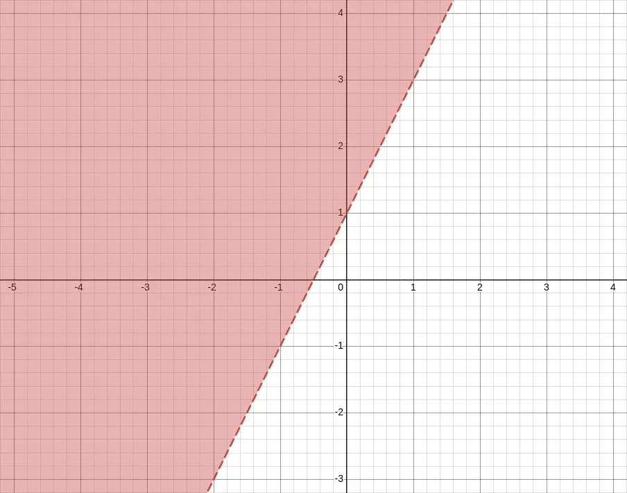
y > 2x + 1How to Graph the Inequality
Graphing an inequality involves more than just plotting a line, it’s about showing all the possible solutions that satisfy the condition. By following a systematic approach, you can accurately visualize which side of the line represents the solution set and distinguish between strict and inclusive inequalities.
Here’s a simple process to follow when you want to graph the inequality:
1. Start with the Equation
The first step in graphing an inequality is to temporarily treat it like a standard equation. This helps establish the boundary that separates the solution region from the rest of the graph. For instance, converting y < 2x + 1 into y = 2x + 1 gives you the line to plot, which will later help determine the shading direction.
Take the inequality and treat it like an equation for a moment.
Example:y < 2x + 1
Graph the boundary line: y = 2x + 1
2. Draw the Boundary Line
Once you have the boundary equation, you can decide how to draw the line. Use a dashed line for inequalities that are strict (< or >), and a solid line for inclusive inequalities (≤ or ≥). This line acts as the dividing line, indicating which region contains the values that satisfy the inequality.
- If the inequality is
<or>, use a dashed line - If it’s
≤or≥, use a solid line
This line separates the graph into two regions: one that satisfies the inequality and one that doesn’t.
3. Choose a Test Point
To determine which side of the boundary line to shade, select a point that is not on the line, typically (0, 0) if it is convenient. Substitute this point into the original inequality. If the inequality holds true, shade the region containing that point; if it’s false, shade the opposite side. This ensures your graph accurately represents all valid solutions.
Pick a point that’s not on the line (usually the origin, (0, 0), works well unless the line passes through it).
Plug the test point into the original inequality:
- If true, shade that side of the graph
- If false, shade the other side
Example:
For y < 2x + 1, test (0, 0):0 < 2(0) + 1 → 0 < 1 → True
So you shade below the line.
Graph the Inequality Examples
Seeing examples makes it easier to understand how inequalities translate to graphs. By working through specific inequalities, you can see how boundary lines and shading come together to visually represent solution sets.
Example 1: y > x - 2
For this inequality, first graph the boundary line y = x - 2 using a dashed line, since the inequality is strict. Then, test the point (0, 0). Since 0 > -2 is true, the region above the line is shaded, representing all possible solutions that satisfy the inequality.
- Graph
y = x - 2(dashed line) - Test point: (0, 0) →
0 > -2→ True - Shade above the line
Example 2: y ≤ -0.5x + 3
Here, the boundary line is y = -0.5x + 3, drawn as a solid line because the inequality is inclusive. Testing (0, 0) gives 0 ≤ 3, which is true. Therefore, the area below the line is shaded, showing all solutions that meet the inequality condition.
- Graph
y = -0.5x + 3(solid line) - Test point: (0, 0) →
0 ≤ 3→ True - Shade below the line
Tips for Graphing Inequalities
To make graphing easier and more accurate, always rearrange your inequality into slope-intercept form (y = mx + b) first. This gives you a clear slope and y-intercept to plot. Remember that dashed lines represent strict inequalities and solid lines represent inclusive ones. Using test points can help confirm the correct shading, and always double-check your work to ensure the solution area is correctly identified.
- Always rearrange into slope-intercept form (y = mx + b) first
- Dashed = strict, Solid = inclusive
- Use test points if you’re unsure where to shade
- Check your shading direction after graphing to avoid errors
Graph the Inequality: Real-World Applications
Graphing inequalities is not just an academic exercise; it has many practical applications. Economists use inequalities to show budget constraints, engineers model safe operating ranges, and decision-makers use them to establish boundaries in optimization problems. Visualizing these regions helps in planning, analysis, and problem-solving.
Graphing inequalities is used in:
- Budget constraints in economics
- Feasibility regions in linear programming
- Modeling safe ranges in science and engineering
- Decision boundaries in machine learning
Tools to Help You Graph the Inequality
A variety of tools make graphing inequalities faster and more precise. Graphing calculators can plot lines and shading automatically, while free online tools like Desmos or GeoGebra provide interactive experiences. Even spreadsheet programs like Google Sheets or Excel can be used to create basic visual representations of inequalities.
You can graph inequalities using:
- Graphing calculators
- Desmos (free online tool)
- GeoGebra
- Spreadsheet tools like Google Sheets or Excel (for simple inequality visuals)
How to Graph the Inequality Using Desmos
Desmos is a versatile online graphing calculator that simplifies plotting inequalities. By entering the inequality into the input field, Desmos instantly generates the boundary line and shades the solution region. It supports dashed and solid lines, allows multiple inequalities, and provides a clear visual representation that helps avoid mistakes common in hand-drawn graphs.
Desmos is a free online graphing calculator that makes it easy to plot linear inequalities visually. Here’s how to use it step by step:
1. Open Desmos
Visit the Desmos Graphing Calculator: https://www.desmos.com/calculator
You’ll see a blank graph on the right and input fields on the left.
2. Enter the Inequality
In one of the input boxes, type the inequality you want to graph. For example:
y < 2x + 3
Desmos will:
- Draw a dashed line for
<or>inequalities. - Use a solid line for
≤or≥inequalities. - Automatically shade the region that represents all the solutions to the inequality.
The following image shows the example y < 2x + 3 in Desmos.
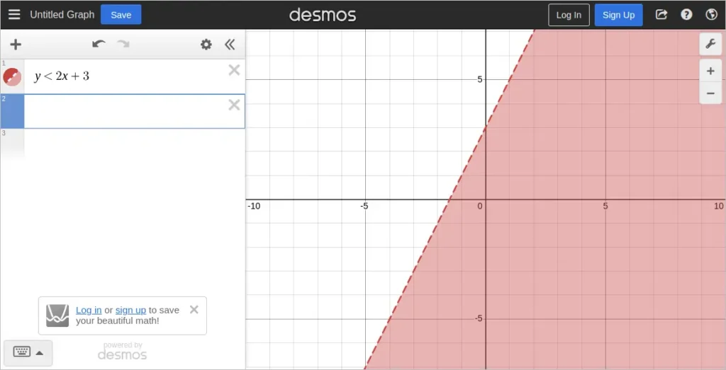
y < 2x + 3 Shown in Desmos3. Explore Other Inequality Types
Try typing in these variations to see how Desmos changes the graph:
y > 2x + 3(shaded above, dashed line)y ≤ 2x + 3(shaded below, solid line)y ≥ -x + 1(shaded above, solid line)
You can also plot multiple inequalities to see overlapping solution areas, which is especially useful for solving systems.
4. Use Test Points (Optional)
If you’re unsure which area is shaded, you can add a test point (like (0, 0)) to the graph:
(0, 0)
This lets you visually confirm whether a specific point lies in the solution region.
Desmos is a powerful tool for students and teachers because it instantly shows the correct boundary line and shaded region. It also helps you avoid mistakes that might happen when drawing graphs by hand.
Frequently Asked Questions on How to Graph the Inequality
What is the difference between a strict and an inclusive inequality?
A strict inequality (< or >) does not include the boundary line in the solution set, while an inclusive inequality (≤ or ≥) does. This is why strict inequalities are drawn with dashed lines and inclusive ones with solid lines.
Can I use any test point to determine shading?
Yes, as long as the test point is not on the boundary line. A common choice is (0, 0), but if the line passes through it, select another simple point that’s easy to calculate.
Why is slope-intercept form recommended for graphing?
Slope-intercept form (y = mx + b) clearly shows the slope and y-intercept, making it straightforward to plot the line and determine how the graph should be shaded.
Are there any online tools besides Desmos to graph inequalities?
Yes, GeoGebra is another free interactive tool. Some graphing calculators and spreadsheet software like Excel or Google Sheets can also help visualize inequalities, though with less interactivity.
How can I graph multiple inequalities at once?
Tools like Desmos and GeoGebra allow you to enter multiple inequalities, which will show overlapping solution areas. This is especially helpful for visualizing systems of inequalities.
Final Thoughts on How to Graph the Inequality
Learning how to graph the inequality not only improves your math skills but also helps you solve real-world problems where constraints matter. By understanding boundary lines and shading regions correctly, you can quickly visualize where solutions exist and where they don’t.
You may be interested in our other graphing math functions.