Learning to make a scatter graph is an essential skill for anyone working with data. Scatter graphs are used to show the relationship between two numerical variables. In this guide, you’ll learn exactly how to create a scatter chart in Excel, Google Sheets, and LibreOffice Calc, with step-by-step examples and tips for accuracy.
Table of Contents
- What Is a Scatter Graph?
- Scatter Graph Example Data
- How to Make a Scatter Graph in Excel
- How to Make a Scatter Graph in Google Sheets
- How to Make a Scatter Graph in LibreOffice Calc
- Make a Scatter Graph Tips
- Did You Know?
- Common Mistakes When Making a Scatter Graph
- Related Graph Types to Explore
- Frequently Asked Questions About how to Make a Scatter Graph
- Conclusion on How to Make a Scatter Graph
What Is a Scatter Graph?
A scatter graph, also called a scatter plot, is a type of chart that displays values for two variables for a set of data. Each point on the graph represents one observation, plotted along the horizontal (X) axis and the vertical (Y) axis. Scatter graphs are particularly useful for identifying patterns, trends, and relationships between variables, such as correlations or clusters. By visually representing the data points, they make it easier to see how one variable may influence another, which is helpful in both academic and professional data analysis.
A scatter graph (also known as a scatter plot or scatter chart) is a chart that uses dots to represent values for two different variables, one plotted along the x-axis and the other along the y-axis. This visualization helps identify trends, clusters, and correlations between data points.
Scatter graphs are commonly used in research, business analysis, and science to determine how one variable affects another.
Scatter Graph Example Data
Before creating a scatter graph, it’s helpful to look at example data to understand how it should be organized. Scatter graphs typically require two sets of related data: one for the X-axis and one for the Y-axis. Organizing your data in a clear and structured table ensures that the graph will accurately reflect the relationship between the variables.
Below is a realistic two-column dataset (30 students) with repeated Hours Studied (X) values and varied Test Score (Y) values (scores include natural variation / noise). You can copy this straight into Excel (or Google Sheets / LibreOffice Calc) and plot a proper scatter plot. Steps for each different software package follow.
Table: Hours Studied (X) vs Test Score (Y)
In this example, we are examining how the number of hours studied affects test scores. Each row in the table represents one student’s study hours and the corresponding score on a test. This simple format allows you to plot each pair of values directly onto a scatter graph and observe potential trends, such as whether studying more hours generally leads to higher scores.
| Hours Studied (X) | Test Score (Y) |
|---|---|
| 0 | 48 |
| 0 | 52 |
| 1 | 55 |
| 1 | 50 |
| 2 | 59 |
| 2 | 62 |
| 2 | 55 |
| 3 | 66 |
| 3 | 64 |
| 3 | 60 |
| 4 | 70 |
| 4 | 67 |
| 4 | 72 |
| 5 | 76 |
| 5 | 74 |
| 5 | 71 |
| 6 | 79 |
| 6 | 82 |
| 6 | 76 |
| 7 | 85 |
| 7 | 80 |
| 8 | 90 |
| 8 | 88 |
| 9 | 92 |
| 9 | 89 |
| 10 | 96 |
| 10 | 98 |
| 2 | 60 |
| 3 | 65 |
| 4 | 69 |
How to Make a Scatter Graph in Excel
Excel is one of the most widely used tools for creating scatter graphs thanks to its user-friendly interface and built-in chart features. With Excel, you can quickly input your data, generate a scatter plot, and customize it to highlight trends and patterns. Whether you are analyzing business metrics, student scores, or scientific data, Excel makes it easy to visualize relationships between variables.
Microsoft Excel offers a powerful and flexible way to visualize data relationships. Here’s how to create a scatter chart step-by-step.
Steps to Make a Scatter Graph in Excel
Creating a scatter graph in Excel involves selecting your data, inserting a scatter chart, and customizing the axes and labels. By following these steps carefully, you can ensure that your scatter plot is both accurate and visually clear. Excel also offers options to add trendlines, adjust marker styles, and apply colors to improve readability and interpretability.
- Prepare your data: Arrange your data in two columns, X values on the left and Y values on the right.
- Select your data: Highlight both columns.
- Insert the chart: Go to Insert → Charts → Scatter (X, Y) and choose the desired style. In Office 365 Select Insert from the top menu, a drop-down box with images of graphs appears on the toolbar. Click the down arrow to expand the box. Under the Scatter heading, click “Scatter with only markers”. (See the first image below)
- Format your chart:
- Add axis titles and a chart title.
- Use different colors or markers for clarity.
- Add a trendline (optional): Right-click a data point and select Add Trendline to show correlation strength.
This is the easiest method for how to make a scatter plot in Excel and works in most versions, including Office 365 and Excel 2021.
Insert the Scatter Graph
In Office 365 Select Insert from the top menu, highlighted with a red dot at the top left of the image below. As a result a drop-down box with images of graphs appears on the toolbar. Click the down arrow to expand the box, highlighted by a red dot at the top right in the image below. Under the Scatter heading of the drop-down box, click “Scatter with only markers”. As a result a graph image is inserted in the Excel spreadsheet.

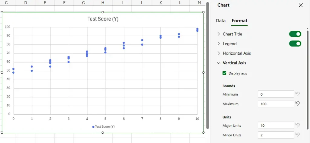
Format the Graph Size and Limits
Pull a handle at the corner of the graph and hold Shift at the same time. This resizes the graph in proportion without distorting it. The following image shows the resized graph.

The above image shows the number of hours up to 12 on the x axis and percentage up to 120 on the y axis. These values are better kept within the limits of 10 hours and 100%. Change these values as follows. Click the graph image to select it. Click the Format button on the toolbar. This opens the Chart pane at the right of the Excel window. Expand the Horizontal Axis item in the Chart pane. Under Bounds, change the Maximum value from 12 to 10.
In a similar way, expand the Vertical Axis item in the Chart pane. Under Bounds, change the Maximum value from 120 to 100. The result is shown in the image below.
Format the Graph Labels
Change the graph axis titles under the same Vertical Axis and Horizontal Axis items in the Chart pane from the previous section. For example, with the Horizontal Axis item expanded scroll down to the Axis Title button. Click the button to enable the axis title. As a result a text box appears. Enter text in this box to label the horizontal axis. Do the same for the Vertical Axis. The following image shows the horizontal axis title setting. Double-click the graph title to edit it. This is the title at the top of the graph.

Optionally Add a Trendline
Right-click on one of the dots or data points of the scatter chart. As a result a menu appears. Click Add Trendline on the menu. Be sure to click on an actual data point and not just on the graph or on a grid line. Otherwise the correct menu will not pop up. The following image shows the menu.

The following image shows the result of adding the trendline to the Excel scatter plot chart.

How to Make a Scatter Graph in Google Sheets
Google Sheets provides a convenient, cloud-based option for creating scatter graphs. Its interface is similar to Excel, allowing you to enter data and generate charts without the need for specialized software. Google Sheets is particularly useful for collaboration, as multiple users can view and edit the chart in real time.
Google Sheets makes it simple to create a scatter chart online and share it instantly.
Steps
To make a scatter graph in Google Sheets, you start by organizing your data into two columns. Then, using the chart tools, you can insert a scatter plot and customize it with titles, axis labels, and point markers. Google Sheets also allows you to adjust the chart layout and add trendlines, making it simple to explore relationships in your data.
- Enter your X and Y data in two adjacent columns.
- Select your data range.
- Click Insert → Chart.
- In the Chart Editor, choose Scatter chart as the chart type.
- Customize your chart with labels, titles, and colors.
Google Sheets automatically updates the scatter chart when you modify the underlying data, making it great for collaborative work. The following image shows the scatter graph in Google Sheets.

Add a Trend Line in Google Sheets
Add a trend line in the Google Sheets scatter graph as follow.
Open the chart editor: Click the graph to select it. Next, click the three dots in the top right corner of the graph image. On the menu that pops up, click Edit the chart. This opens the Chart editor pane.
Click the Customize tab at the top of the Chart editor pane. Expand the Series item in the Customize pane. Scroll down the pane to find a group of check boxes. One of the check boxes is a Trend line box. Finally click this box to check it and the trend line is added, as the following image shows.

How to Make a Scatter Graph in LibreOffice Calc
LibreOffice Calc is a free and open-source spreadsheet tool that also supports scatter graphs. While it may have a slightly different interface than Excel or Google Sheets, the process of creating a scatter plot is straightforward. Calc is ideal for users who prefer an offline tool or want a no-cost alternative for data visualization.
LibreOffice Calc provides an open-source option for creating scatter graphs.
Steps
In LibreOffice Calc, you begin by selecting the cells containing your X and Y values. Using the “Insert Chart” feature, choose the scatter graph type and configure your axes and labels. You can customize the markers, line styles, and add gridlines to make the graph more readable. Calc also allows adding regression lines to visualize trends clearly.
- Input your X and Y data in two columns.
- Select your data.
- Click Insert → Chart.
- Choose XY (Scatter) and click Next.
- Adjust your axes, grid lines, and titles in the setup wizard.
- Click Finish to create your scatter graph.
Calc also allows trendlines and equation displays similar to Excel, making it a reliable free alternative. The following image shows how to make a scatter graph in LibreOffice Calc.

Insert a Trend Line in LibreOffice Calc Scatter Graph
Optionally add a trend line to the graph in LibreOffice Calc as follows. First double-click the graph so that a thick grey border appears around the outside of the graph. Next right-click on one of the data points of the graph. As a result a menu pops up. Finally click the Insert Trend Line… option on the pop-up menu. This inserts a trend line into the graph.
Be sure to first double-click the graph and then right-click on one of the data points. If you right-click on the graph, rather than on a data point, the wrong menu will appear. The image below shows the LibreOffice Calc scatter graph with a trend line added.

Make a Scatter Graph Tips
When making a scatter graph, clarity and accuracy are key. Choose appropriate scales for your axes to avoid misleading representations of your data. Label your axes clearly, include units where applicable, and consider adding a trendline to highlight correlations. Additionally, avoid overcrowding your chart with too many data points, which can make patterns harder to interpret.
- Use clear axis labels to identify both variables.
- Avoid overlapping points: Use smaller markers or transparency for dense data.
- Add a trendline to emphasize correlations.
- Keep scaling consistent: Ensure both axes are proportionate for accurate interpretation.
- Use color coding if plotting multiple data sets.
Did You Know?
The scatter graph was first used by statistician Francis Galton in the 19th century to study heredity patterns. His work laid the foundation for the concept of correlation and regression analysis, core principles in modern data science.
Scatter graphs are not only useful in academic research and business analytics but also in everyday applications like sports performance tracking and health monitoring. By visualizing relationships, scatter graphs help identify patterns that might otherwise be hidden in raw data.
In addition, scatter plots can reveal outliers or unusual observations that may indicate errors in data collection or unique cases worth further investigation. Scientists and analysts often use these insights to refine experiments, improve decision-making, or develop predictive models.
Scatter graphs also form the basis for more advanced statistical analyses, such as correlation coefficients and regression models. These tools quantify the strength and direction of relationships, providing a deeper understanding beyond visual trends alone.
Common Mistakes When Making a Scatter Graph
One of the most common mistakes is plotting data with inconsistent or incorrect scales, which can distort the apparent relationship between variables. Another error is failing to label axes or units, leaving viewers uncertain about what the graph represents. Overloading the graph with too many points or combining unrelated datasets can also reduce clarity and mislead interpretations. Here is a list summarizing the most common scatter graph mistakes.
- Mixing categorical data: Scatter graphs should only display numerical variables.
- Forgetting axis labels: Without proper labeling, the chart loses clarity.
- Overcomplicating visuals: Too many colors or shapes can distract from the data trend.
- Assuming causation: A strong correlation doesn’t always mean one variable causes the other.
Related Graph Types to Explore
Scatter graphs are part of a broader family of data visualization tools that help analyze relationships. Related types include line graphs, which are ideal for showing trends over time; bubble charts, which add a third variable to scatter plots; and heatmaps, which provide a visual representation of data density or intensity. Exploring these alternatives can offer additional insights depending on the nature of your data.
If you enjoyed learning to make a scatter graph, you might also explore:
- Line graphs: Show continuous data trends over time.
- Bubble charts: Display three-variable data in two dimensions.
- Histogram charts: Reveal frequency distributions within datasets.
Frequently Asked Questions About how to Make a Scatter Graph
What is a scatter graph used for?
A scatter graph is used to explore the relationship between two variables. It is commonly applied in statistics, research, and data analysis to identify correlations, trends, clusters, and outliers. By visually representing the data points, users can detect patterns that may inform predictions, hypotheses, or business decisions.
How do I make a scatter graph with multiple data sets?
To make a scatter graph with multiple data sets, you can plot each set of X and Y values as a separate series on the same graph. In Excel or Google Sheets, you can add additional data series through the chart editor, assigning distinct colors or marker shapes to differentiate them. This allows for direct comparison of trends or relationships across different groups or conditions.
What’s the difference between a scatter plot and a line graph?
A scatter plot displays individual data points without connecting lines, emphasizing the relationship between two variables, while a line graph connects points with lines to show trends over time or continuous changes. Scatter plots are best for observing correlations and distributions, whereas line graphs are ideal for illustrating progression, patterns, or sequences.
How do I label data points in Excel?
In Excel, you can label data points by selecting the chart and using the “Add Data Labels” feature. For more control, you can customize each label to display values, names, or categories. This is particularly useful when highlighting specific points of interest, outliers, or categories in your scatter graph for easier interpretation.
Conclusion on How to Make a Scatter Graph
Knowing how to make a scatter graph helps you visualize relationships in data and draw meaningful conclusions. Whether you’re using an Excel scatter chart, Google Sheets, or LibreOffice Calc, the steps are simple and adaptable. Mastering scatter plotting is a vital skill for analysts, students, and researchers alike—turning raw numbers into clear visual insights.
Learn how to create graphs of various types.