A progress chart is one of the most useful tools for visualizing progress toward a goal, task completion, or project milestone. Whether you’re managing a personal goal, tracking team performance, or creating business reports, a progress chart provides a clear, visual snapshot of how close you are to achieving your target.
In this guide, we explain what a progress chart is, how to make one, and the best ways to customize it for different purposes.
Table of Contents
- What Is a Progress Chart?
- How to Create a Progress Chart in Excel
- How to Create a Progress Chart in Google Sheets
- How to Create a Progress Chart in LibreOffice Calc
- Tips for Graphing Progress Charts
- Did You Know?
- Other Interpretations of Progress Chart
- Common Mistakes When Graphing Progress Charts
- Frequently Asked Questions
- What is a progress chart used for?
- How do I create a progress chart in Excel?
- Can I make a progress graph in Google Sheets?
- Where can I find a free progress chart template?
- What’s the difference between a progress bar graph and a progress chart?
- How do I make a circular progress chart?
- What is a progress bar graphic used for?
- Related Graph Types to Explore
- Conclusion
What Is a Progress Chart?
A progress chart is a visual tool designed to track changes or improvements over time. By presenting data graphically, it makes trends, milestones, and overall performance easy to understand at a glance. Progress charts can be applied in many contexts, from monitoring personal fitness goals to tracking project completion in a workplace. They serve not only as a record of achievement but also as a motivational tool, helping individuals and teams identify areas for improvement and celebrate successes along the way.
A progress chart visually represents advancement toward a specific goal or set of objectives. It can show percentage completion, timelines, or performance metrics. This chart helps users quickly identify how much work is done and what remains, making it a popular choice for project managers, students, and businesses.
Common types include:
- Progress bar graphs showing completion as a horizontal or vertical bar.
- Progress graphs that plot multiple milestones or percentages.
- Circular progress charts used in dashboards or reports.
How to Create a Progress Chart in Excel
Creating a progress chart in Excel begins with organizing your data in a clear and structured table. Typically, you’ll want to list the tasks, goals, or metrics you’re tracking along with the corresponding time intervals or target values. Excel offers various chart types, such as bar charts, line charts, and stacked columns, which can all be adapted to show progress. By choosing the right chart type and formatting it properly, you can make your data more readable and visually appealing, ensuring the chart effectively communicates the story behind your progress.
Making a progress chart in Excel is straightforward and customizable. Excel’s built-in chart tools allow users to visualize progress dynamically as data updates.
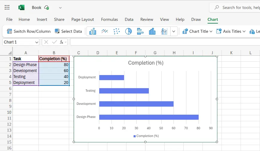
Step 1: Enter Your Data
Start by entering your task names and their completion percentages in two columns.
| Task | Completion (%) |
|---|---|
| Design Phase | 80 |
| Development | 60 |
| Testing | 40 |
| Deployment | 20 |
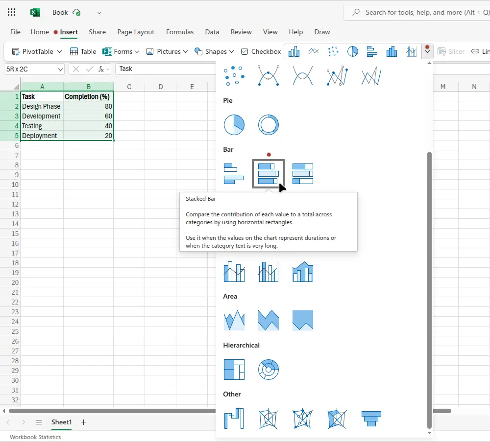
Step 2: Insert a Chart
- Highlight your data.
- Go to Insert → Bar Chart, or Insert → Insert Chart (drop-down box) as shown in the following image.
- Choose a simple bar or stacked bar design.
Step 3: Customize It
You can make an Excel progress graph more visually appealing by:
- Adding labels that show percentage values.
- Using conditional formatting or gradient colors.
- Adjusting chart titles and axis labels.
Step 4: Add Visual Flair
Consider turning your bar chart into a progress bar graphic by:
- Removing gridlines.
- Using one solid color for completed progress.
- Adding data labels for clarity.
The following image shows the chart made in Excel using the data from the table near the beginning of this section.
How to Create a Progress Chart in Google Sheets
Google Sheets makes it easy to build a progress chart that updates automatically as your data changes. This is perfect for shared projects or real-time goal tracking since Sheets allows multiple collaborators to edit and view the same chart online.
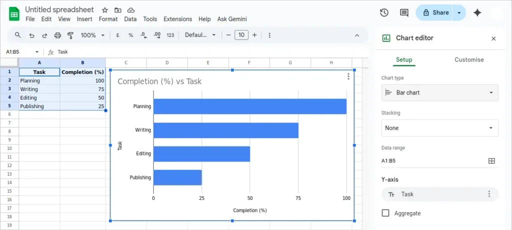
Step 1: Enter Your Data
Add your tasks and completion percentages into two columns, just like in the previous Excel example.
Example data:
| Task | Completion (%) |
|---|---|
| Planning | 100 |
| Writing | 75 |
| Editing | 50 |
| Publishing | 25 |
Step 2: Insert a Chart
- Highlight the data range.
- Click Insert → Chart from the top menu.
- Under “Chart type,” choose Bar chart or Column chart to create a visual progress graph.
Step 3: Customize Your Progress Chart
Use the Customize tab in the Chart Editor to:
- Change bar colors to represent completed vs. pending progress.
- Add labels showing percentages.
- Remove unnecessary gridlines for a cleaner progress bar graphic look.
Step 4: Automate Updates
If your completion percentages change often, link them to formulas or linked sheets. Your Google Sheets progress chart will automatically refresh as data updates, making it an ideal tool for teams and classrooms.
The following image shows the result of the previous steps taken to insert the progress bar graph in Google Sheets.
How to Create a Progress Chart in LibreOffice Calc
LibreOffice Calc offers a free and open-source way to create a progress graph or chart without relying on online software. It includes similar chart tools to Excel and Google Sheets, making it a great option for users who prefer offline work.
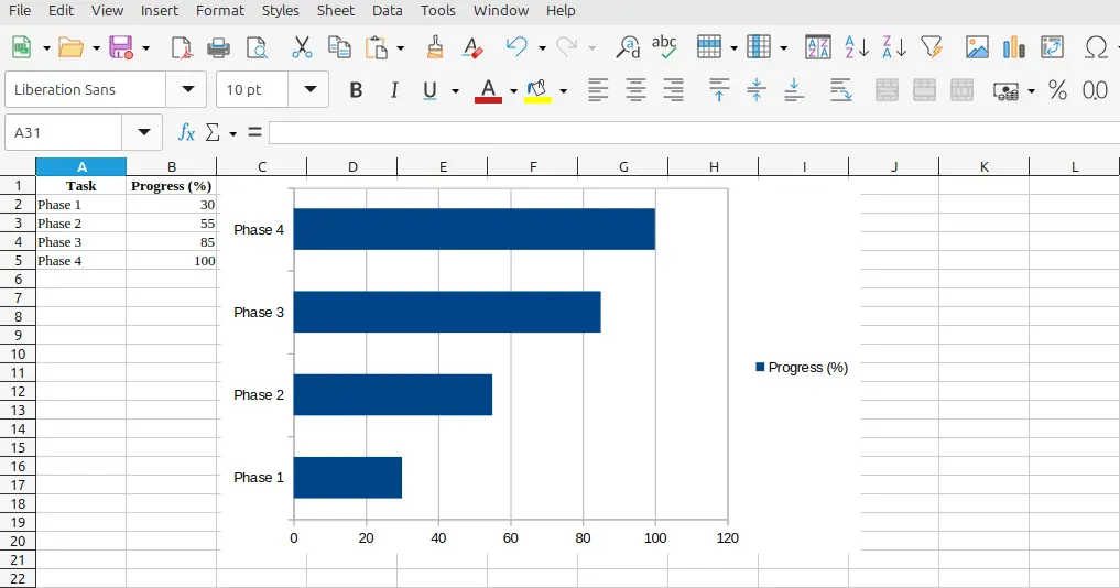
Step 1: Input Your Data
Start a new spreadsheet and list your data in two columns:
| Task | Progress (%) |
|---|---|
| Phase 1 | 30 |
| Phase 2 | 55 |
| Phase 3 | 85 |
| Phase 4 | 100 |
Step 2: Create a Chart
- Select your data range.
- Click Insert → Chart.
- In the Chart Wizard, select Bar chart or Column chart as your type.
- Click Finish to generate the chart.
Step 3: Format Your Progress Graph
You can make your LibreOffice Calc chart stand out by:
- Adjusting bar colors and spacing.
- Adding data labels to show exact percentages.
- Removing legends if unnecessary for a cleaner progress bar graph style.
Step 4: Save or Export
LibreOffice allows you to save your progress bar chart directly as an image or PDF for presentations or reports. This makes it a powerful, free progress bar chart solution for users who want full control over their files without cloud dependence.
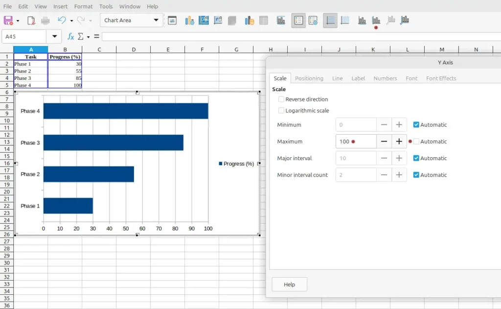
The image below shows a normal bar chart inserted into a LibreOffice Calc spreadsheet. It automatically sets the x-axis range from 0 to 120, which is not what we want in this example. We want it to show 0 to 100% instead, which is explained next
Set the Chart Range
Change the LibreOffice Calc graph x-axis range: first double-click the chart. This puts a grey border around the chart image. It also brings up new items on the tools menu. In this case, click the Y Axis icon. This is because the graph is actually seen as being on its side, so what we think is the X-axis is actually the Y-axis. Alternately, select Format → Axis → Y Axis… from the top menu.
In the dialog box that pops up click the Scale tab. Next, uncheck Automatic next to the Maximum setting. Finally manually change the maximum value to 100, and then click the OK button. The following image shows these settings.
Tips for Graphing Progress Charts
When graphing progress charts, clarity and simplicity are key. Avoid overcrowding your chart with too many data points or excessive formatting, as this can make trends harder to interpret. Use consistent colors and labels to highlight important milestones, and consider adding data markers or trendlines to emphasize growth patterns. Regularly updating your chart ensures it reflects the most recent progress and helps maintain motivation by providing an accurate visual of achievements over time.
Creating an effective progress chart takes more than just plotting data. Follow these tips for best results:
- Keep it simple: Avoid overcrowding with too much information.
- Use consistent color coding: For example, green for completed tasks, yellow for in progress.
- Highlight milestones: Add markers for key dates or completion goals.
- Use templates: Many sites offer free progress chart templates that save time.
- Update regularly: A progress chart is only useful if it reflects current data.
Did You Know?
The earliest progress graphs were hand-drawn during large engineering projects in the 19th century, such as railroad construction. Modern digital tools have transformed them into interactive dashboards that automatically update in real-time, making progress tracking faster and more accurate.
Progress charts are not just useful for personal goals, they are widely used in business and education as well. Teachers often employ them to monitor student performance, while managers use them to track team productivity or project deadlines.
Some progress charts, like the Gantt chart, are specifically designed to illustrate project schedules, showing both completed tasks and upcoming work. Other types, such as burndown charts, are popular in agile project management to visualize remaining work versus time.
Progress charts can also incorporate predictive elements. By analyzing historical data, some charts can help forecast future outcomes, allowing better planning and resource allocation. Additionally, integrating conditional formatting or color coding in your chart can make it instantly clear when targets are being met or missed.
Other Interpretations of Progress Chart
While most people associate progress charts with tracking performance or goals, they can also represent broader concepts such as growth, improvement, or development in non-numerical areas. For instance, a visual progress chart might depict skill acquisition, habit formation, or even emotional well-being over time. These alternative interpretations expand the usefulness of progress charts beyond strictly measurable outcomes, offering a way to visualize qualitative progress as well.
Sometimes, when people search for “progress chart,” they may mean:
- Progress bar graph – a simple linear chart showing completion percentage.
- Progress bar graphic – a stylized version used in reports or presentations.
- Circular progress graph – a radial display often used in dashboards or fitness apps.
Each of these types communicates the same idea: visual progress toward completion, but in different visual formats.
Common Mistakes When Graphing Progress Charts
A frequent mistake when creating progress charts is misrepresenting data by using inconsistent scales or failing to update the chart regularly. Another common error is including too many variables in a single chart, which can confuse the viewer and obscure meaningful trends. Selecting the wrong chart type for your data can also make the information harder to interpret, so understanding your dataset and choosing a chart that accurately reflects progress is essential.
Avoid these errors when creating a progress chart:
- Incorrect data ranges: Missing or misaligned values lead to inaccurate visuals.
- Overcomplicated formatting: Too many effects can obscure the message.
- Ignoring data labels: Without labels, viewers can’t interpret completion levels easily.
- Inconsistent scale: Always ensure that 100% completion is clearly represented.
Frequently Asked Questions
What is a progress chart used for?
A progress chart is used to visually display how much of a goal or project has been completed. It helps track and communicate progress clearly.
How do I create a progress chart in Excel?
Use a bar or stacked bar chart, enter your completion percentages, and format it to represent progress toward 100%.
Can I make a progress graph in Google Sheets?
Yes, Google Sheets allows you to create a similar progress graph using bar or column charts.
Where can I find a free progress chart template?
Websites like Canva, Microsoft Office Templates, and charting platforms offer free progress chart templates for easy customization.
What’s the difference between a progress bar graph and a progress chart?
A progress bar graph is a single type of progress chart, typically linear, while a progress chart can include bars, circles, or more advanced visuals.
How do I make a circular progress chart?
Use a donut chart in Excel and adjust the percentage data to represent completion visually.
What is a progress bar graphic used for?
A progress bar graphic is used in visual reports, presentations, and dashboards to make data more engaging and easier to understand.
Related Graph Types to Explore
Progress charts are part of a larger family of visual data tools. Line charts, bar charts, and area charts are all related options that can display trends over time in a similar way. Gantt charts and burndown charts are specialized formats often used in project management to track completion rates and remaining work. Exploring these related graph types can help you choose the most effective way to represent your progress data and make comparisons between different metrics easier.
If you’re interested in more ways to visualize progress or performance, check out these tutorials:
- Bar Chart – Ideal for comparing multiple tasks. The article on creating a bar graph has more information.
- Pie Chart – Great for showing proportions of completed work. See How to Start Creating Pie Charts.
- Gantt Chart – Perfect for tracking project timelines.
Conclusion
A progress chart is an essential visualization for tracking progress toward goals and displaying results effectively. Whether you create a progress chart in Excel, design an Excel progress graph, or download a free progress chart template, the key is clarity. When built well, a chart transforms complex data into a clear, motivating visual representation of success.