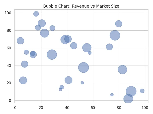
When you want to visualize the relationship between three variables in a single, easy-to-read graph, a bubble chart is one of the best tools to use. This chart type expands on a traditional scatter plot by adding a third dimension through bubble size, giving your data more depth and context.
From comparing sales performance to analyzing demographic data, bubble charts provide a clear and visually appealing way to uncover patterns that might otherwise go unnoticed.
Table of Contents
- What Is a Bubble Chart?
- Purpose And Use Of A Bubble Chart
- How To Graph A Bubble Chart Step-By-Step
- Bubble Chart Example
- Bubble Graph Example: Visualizing Marketing Campaign Performance
- Other Interpretations Of Bubble Chart
- Common Mistakes When Graphing Bubble Charts
- Tips For Graphing Bubble Charts
- Did You Know?
- Frequently Asked Questions
- Related Graph Types To Explore
- Conclusion
What Is a Bubble Chart?
A bubble chart is a visual tool that displays relationships between multiple variables using circles of different sizes. Before looking at specific uses, it helps to think of a bubble chart as an expanded version of a scatter plot, one that adds a third dimension of information. This makes it ideal for showing patterns or clusters that depend on more than just two numeric measurements.
Horizontal and vertical axes are used to show two variables, while the size of each bubble represents a third variable. Because each bubble can vary in both position and scale, this type of chart helps you see how different factors interact at the same time. It is commonly used in business, finance, demographics, and scientific data where comparing multiple dimensions at once is useful.
Put another way, a bubble chart is a data visualization that displays three variables in a single two-dimensional graph. The x-axis and y-axis represent two numerical variables, while the bubble size (area or radius) represents a third variable.
This makes it especially useful for showing relationships, comparisons, and patterns between multiple data points.
A bubble chart is ideal when you want to add a third layer of information beyond what a scatter plot can show, making it one of the most visually rich chart types in data analysis.
Purpose And Use Of A Bubble Chart
The main purpose of a bubble chart is to reveal how several variables relate to one another in a single view. Before diving into specific use cases, it helps to understand that bubble charts excel at uncovering patterns that might be missed in simpler graphs. When all three variables interact, you can spot trends, groupings, and outliers more easily.
Bubble charts are often used to compare categories that have different scales or impacts. For example, companies may visualize profit, revenue, and market share all at once. In other fields, such as ecology or public health, bubble charts can help illustrate how population size interacts with other environmental or social factors. This versatility is what makes them especially valuable when data complexity increases.
The main goal of a bubble chart is to visualize how three numerical variables interact with one another. It helps reveal correlations, outliers, and proportional relationships that might not be visible in simpler charts.
Common use cases include:
- Comparing sales performance across regions (X: revenue, Y: profit, bubble size: market share)
- Visualizing population, GDP, and life expectancy in economics
- Analyzing social or environmental datasets where multiple dimensions matter
How To Graph A Bubble Chart Step-By-Step
Before walking through individual steps, it’s helpful to understand the overall process. Creating a bubble chart is essentially about mapping each variable to a component of the chart: one variable on the x-axis, one on the y-axis, and one represented by bubble size. Once this mapping is clear, building the chart becomes a straightforward sequence of organizing data and choosing visual settings.
Creating a bubble chart involves just a few basic steps. These general steps apply to most data visualization software, including Excel, Google Sheets, Tableau, and Python’s Matplotlib.
- Prepare your data: You’ll need three numerical columns – one for the x-axis, one for the y-axis, and one for the bubble size.
- Select your data range: Highlight the three columns of data you want to visualize.
- Insert a bubble chart: Choose Insert → Chart → Bubble Chart (or equivalent in your chosen software).
- Customize labels and colors: Adjust colors, labels, and axis titles for clarity.
- Adjust bubble scaling: Make sure the bubble size range clearly reflects differences without overcrowding the graph.
- Review the chart to ensure each bubble is clear, readable, and accurately sized.
This basic process can be adapted whether you use a spreadsheet tool, a bubble graph maker, or specialized visualization software.
Bubble Chart Example
Before looking at a specific scenario, it helps to understand what a typical bubble chart example demonstrates. Most examples highlight relationships between economic, environmental, or performance-related metrics, allowing you to see how one factor influences another in a real dataset.
A common example is comparing countries by GDP per capita (x-axis), life expectancy (y-axis), and population (bubble size). This reveals not only how wealth and health correlate but also how population changes the interpretation. Larger bubbles immediately draw attention to the most influential or populous groups, giving context that a simple scatter plot would miss.
Suppose you’re visualizing the relationship between company revenue, profit, and number of employees.
- X-axis: Annual revenue (in millions)
- Y-axis: Profit margin (%)
- Bubble size: Number of employees
In this bubble chart example, larger bubbles indicate bigger companies. You might observe that companies with moderate revenue and efficient operations have higher profit margins, revealing valuable business insights.
Table: Bubble Chart Example Data
The following data set shows the annual revenue, profit margin, and number of employees for several companies. Each row represents a different company. When plotted as a bubble chart (see the image that follows the table), the revenue values go on the X-axis, profit margin on the Y-axis, and the bubble size corresponds to the number of employees. This data helps visualize how company size and efficiency relate to profitability.
| Company Name | Annual Revenue (Million $) | Profit Margin (%) | Number of Employees |
|---|---|---|---|
| Alpha Corp | 120 | 18 | 850 |
| Beta Ltd | 45 | 25 | 320 |
| Gamma Inc | 200 | 12 | 1500 |
| Delta Co | 75 | 20 | 480 |
| Epsilon Tech | 30 | 28 | 210 |
| Zeta Systems | 160 | 15 | 980 |
| Omega Group | 250 | 10 | 2200 |
| Sigma Labs | 95 | 22 | 540 |
| Nova Partners | 55 | 24 | 400 |
| Titan Energy | 180 | 14 | 1200 |
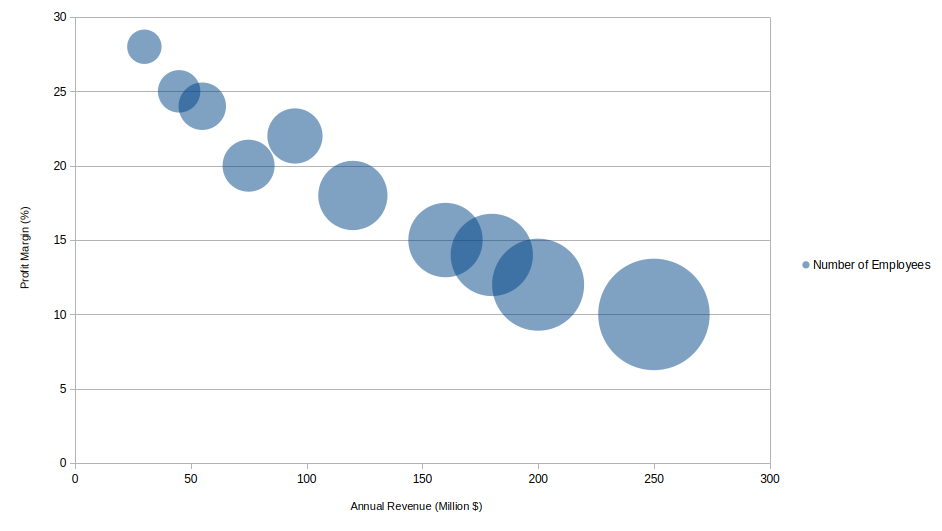
The same chart is made easier to read below by adding labels to each bubble. In addition, it is made wider which results in less overlap between bubbles. Click any image to enlarge it.

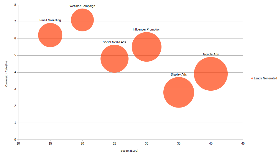
Bubble Graph Example: Visualizing Marketing Campaign Performance
A bubble graph is a powerful way to compare multiple aspects of marketing campaigns at once. In this example, each bubble represents a different advertising campaign. The X-axis shows the budget spent (in thousands of dollars), the Y-axis displays the conversion rate (%), and the bubble size represents the number of leads generated.
By analyzing this bubble graph, you can easily see which campaigns delivered high conversion rates relative to their budgets and which ones reached more people overall.
| Campaign | Budget ($000) | Conversion Rate (%) | Leads Generated |
|---|---|---|---|
| Social Media Ads | 25 | 4.8 | 2,400 |
| Email Marketing | 15 | 6.2 | 1,800 |
| Google Ads | 40 | 3.9 | 3,500 |
| Influencer Promotion | 30 | 5.5 | 2,700 |
| Webinar Campaign | 20 | 7.1 | 1,600 |
| Display Ads | 35 | 2.8 | 2,900 |
In this bubble graph example (image plotted below), you might notice that campaigns with smaller budgets but higher conversion rates, like Email Marketing or Webinar Campaign, perform more efficiently than costlier campaigns with lower conversion rates, such as Display Ads. This kind of visual insight helps marketers allocate resources more effectively for future campaigns.
Other Interpretations Of Bubble Chart
Before listing alternative interpretations, it helps to recognize that bubble charts vary widely depending on the field using them. Different industries adopt this chart type for specific kinds of insight, and the meaning of bubble size or color can shift accordingly.
In marketing, bubble charts may represent customer segments based on purchase frequency, satisfaction scores, and average spending. In project management, they can illustrate task priority, time estimates, and potential impact. Some variations use color coding for an additional variable, allowing the chart to display four dimensions of information at once.
Sometimes, terms like bubble graph or bubble plot are used interchangeably with bubble chart. While the differences are minor, they typically refer to similar visualizations.
- Bubble Graph: A general term for any scatter-type graph that uses bubble sizes to encode data.
- Bubble Plot: Often used in statistics or programming contexts (e.g., R or Python) to describe the same chart type.
Common Mistakes When Graphing Bubble Charts
A good starting point is understanding that bubble charts require more care than simpler graphs because they encode multiple variables simultaneously. A poor choice of scale, bubble size, or spacing can make the chart misleading or difficult to interpret.
Common mistakes include using bubble sizes that are too large, causing overlap and confusion; choosing inappropriate axis scales that distort relationships; or using too many categories, which makes the chart cluttered. Another issue arises when bubble size is not proportional to area but instead scaled by radius, which can visually exaggerate differences. Ensuring consistent formatting and clear labeling can prevent most of these problems. Here is a list of common mistakes made when graphing bubble charts.
- Overlapping bubbles: Too many data points can clutter the chart, making it hard to interpret.
- Unclear scaling: If bubble size doesn’t proportionally match the data, it can mislead viewers.
- Missing labels: Without category or tooltip labels, the chart may be visually appealing but meaningless.
- Too many colors: Overuse of color can distract from the actual data relationships.
Tips For Graphing Bubble Charts
Before applying specific techniques, it helps to remember that the goal of a bubble chart is clarity. Because readers must interpret positions, sizes, and sometimes colors all at once, thoughtful design is essential.
Useful tips include keeping bubble transparency high enough to avoid hiding overlapping values, selecting a clean color palette, and using labels sparingly to maintain readability. It is also wise to use a legend that explains what the bubble size represents, since this variable is often the most abstract for viewers. Experimenting with spacing and scale will help you find the best balance between detail and simplicity.
- Limit the number of bubbles to 15–30 for clarity.
- Use consistent, soft color tones to distinguish categories.
- Label key bubbles or add tooltips for interactivity.
- Use logarithmic scales if the data varies across large ranges.
- Check that bubble areas, not diameters, are scaled correctly to represent magnitude accurately.
Did You Know?
The bubble chart was first popularized by Hans Rosling, who used it to vividly show global development data. His dynamic bubble plots illustrated how life expectancy and income levels evolved across countries, captivating millions of viewers and highlighting how visualization can make complex data accessible.
Bubble charts are sometimes considered a form of multivariate visualization because they present three or more dimensions of data in one place. Not all chart types can show this many dimensions clearly, which gives bubble charts a unique role.
Another interesting point is that bubble charts have roots in early statistical graphics used to compare population and economic factors long before modern software tools existed. Early versions were drawn by hand, requiring careful measurement of bubble radii and spacing.
In modern analytics, bubble charts remain valuable because they can integrate additional visual cues such as color gradients or grouping outlines. This makes them adaptable to today’s large and complex datasets, especially when comparing many categories that interact in significant ways.
Some advanced dashboards even animate bubble charts over time, creating moving bubbles that show trends dynamically. This approach helps viewers understand not only the current relationships but also how they evolve, which can be extremely helpful in forecasting and trend analysis.
Frequently Asked Questions
What is the difference between a bubble chart and a scatter plot?
A scatter plot displays only two variables (X and Y), while a bubble chart adds a third variable represented by bubble size. A bubble chart extends a scatter plot by adding a third variable represented by bubble size. While a scatter plot only shows relationships between two variables, a bubble chart shows how a third factor influences those relationships.
A bubble chart is also more visually expressive because size can emphasize magnitude or importance. However, this added complexity means bubble charts require careful formatting to avoid misinterpretation.
Can a bubble chart show more than three variables?
Yes. While the standard bubble chart shows three variables, additional variables can be displayed through color, grouping, or even labels. Some data tools allow patterns such as hue gradients or category shading to include extra layers of meaning.
More advanced visualizations may incorporate animation, showing changes over time as bubbles move and grow. This effectively turns the chart into a four-dimensional comparison, helping reveal trends that static charts might hide.
What software can create a bubble chart?
Many tools can create bubble charts, including Excel, Google Sheets, Tableau, R, and Python libraries such as Matplotlib and Plotly. Spreadsheet software is ideal for quick charts, while more advanced platforms offer interactive or animated versions.
Choosing the right tool depends on your needs. Business dashboards and statistical software often provide greater customization, making them suitable for complex datasets or professional presentations.
When should I use a bubble chart?
A bubble chart is ideal when you need to compare three or more variables in a single visual. It works best when bubble size meaningfully contributes to the interpretation, such as when highlighting population, impact, or scale.
You should use a bubble chart when relative magnitude is as important as position. It’s particularly useful for spotting clusters, identifying extreme values, or analyzing relationships where size plays a crucial role in understanding the data.
What’s the best way to format bubble sizes?
The best practice is to size bubbles based on area rather than radius, since viewers interpret area more naturally. This prevents visual distortion where one bubble appears larger than it truly is compared to others.
It is also helpful to set a minimum size for small values so they remain visible, and a maximum size to prevent overcrowding. Proper scaling ensures readability and keeps the chart visually balanced.
Related Graph Types To Explore
Before reviewing specific alternatives, it helps to understand that bubble charts belong to a broader family of multivariate visualizations. These related charts often serve similar purposes but may simplify or extend what a bubble chart can show.
Scatter plots, heat maps, radar charts, and treemaps each highlight relationships between variables in different ways. Exploring these options can help you decide which visualization best matches your dataset and the story you want to tell.
If you’re learning about bubble charts, you might also enjoy exploring:
- Scatter plots – for visualizing two-variable relationships
- Area charts – to show cumulative totals or proportions
- Radar charts – for comparing multiple variables per category
Conclusion
A bubble chart is a powerful and visually engaging way to represent relationships among three variables at once. By adjusting bubble position, size, and color, you can highlight meaningful trends and patterns that would be hidden in a table of numbers. Whether you call it a bubble graph, bubble plot, or use an online bubble graph maker, this chart type remains a favorite in data visualization for combining simplicity and depth in one view.