A spider graph (or radar chart) is a two-dimensional chart where each axis represents one variable. All axes start from the same central point, and data values are plotted as points on each axis. When connected, these points form a web-like polygon, hence the name “spider graph.”
Spider / radar graphs are ideal for visualizing multivariate data, especially when comparing multiple items across the same set of categories.
Table of Contents
When Should You Use a Spider Graph?
Spider graphs are ideal when you want to see how multiple items compare across a set of variables at a glance. They allow you to quickly identify patterns, strengths, and weaknesses for each item relative to others, making them perfect for comparisons that involve several categories. Whether you are evaluating products, team performance, or survey responses, a spider graph provides an intuitive, visual way to highlight differences and similarities.
Best used when you want to:
- Compare multiple variables or categories simultaneously
- Show performance metrics or characteristics of multiple items
- Display patterns or outliers in multivariate data
Common use cases include:
- Comparing product features
- Displaying skill assessments or survey results
- Benchmarking performance metrics
Spider Graph Example
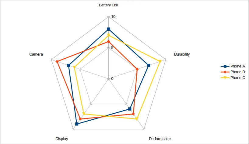
Imagine you’re trying to decide which smartphone to buy. You want to compare three popular models across key features such as battery life, camera quality, display, performance, and durability. A spider graph allows you to plot all these variables on a single chart, giving a clear visual comparison of how each phone performs in each category.
The table below shows the ratings for Phone A, Phone B, and Phone C across the five features. By plotting these scores on a spider graph, each phone creates its own distinct shape. You can immediately spot which phone excels in certain features, like Phone B in camera performance, or Phone C in durability, and see where others fall short. This makes it much easier to evaluate trade-offs and decide which phone best fits your needs.
| Feature | Phone A | Phone B | Phone C |
|---|---|---|---|
| Battery Life | 8 | 6 | 7 |
| Camera | 7 | 9 | 6 |
| Display | 9 | 8 | 7 |
| Performance | 6 | 7 | 8 |
| Durability | 7 | 5 | 9 |
When you plot these values on a spider graph, each phone creates its own shape. You can immediately see which phone performs better in specific categories. The above data is plotted in the image below.
How to Create a Spider Graph (Step-by-Step)
Creating a spider graph is straightforward once your data is organized correctly. The key is to structure your dataset so each category occupies a column, and each item’s values are in adjacent columns. Most spreadsheet tools and visualization software can then transform this organized data into a radar chart, allowing for immediate comparison across multiple dimensions. You can also use Python libraries like Matplotlib or Plotly for more advanced visualizations.
You can make a spider / radar graph / chart using tools like Excel, Google Sheets, or data visualization libraries in Python (e.g., Matplotlib or Plotly).
In Excel
After entering your categories and data, Excel provides several radar chart options to suit your needs. You can choose a simple Radar chart for basic comparisons, Radar with Markers to highlight each data point, or a Filled Radar chart for a more visually striking presentation.
Once the chart is inserted, take time to customize it. Add axis labels, titles, and adjust colors for clarity. Using different line styles or marker shapes for each item can make the chart easier to read and visually engaging, especially when comparing multiple datasets.
- Enter your categories in a column and data for each item in adjacent columns.
- Select the data range.
- Go to Insert > Radar Chart.
- Choose either Radar, Radar with Markers, or Filled Radar chart type.
- Customize your chart with labels, titles, and colors.
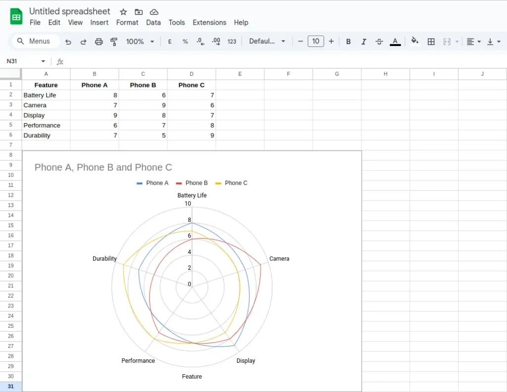
In Google Sheets
Google Sheets also makes creating spider graphs easy. After selecting your data, the Chart editor lets you pick the Radar chart type. You can then tweak chart colors, add labels, and adjust axis scales.
Customizing the chart ensures your comparison is clear and effective. For example, you might use distinct colors for each item or adjust the axis maximums so that differences between variables are easier to discern. This helps prevent clutter and keeps your spider graph readable.
- Enter your categories in a column and data for each item in adjacent columns.
- Select the data range.
- Go to Insert > Chart using the top menu bar.
- In the Chart editor at the right of the screen, click the drop-down menu under Chart type. Choose Radar chart from the drop-down list.
- Customize your chart with labels, titles, and colors.
Tips for Using Spider Graphs Effectively
Spider graphs are powerful but can become difficult to interpret if overused or poorly designed. Before creating one, consider how many variables and items you are comparing, and whether the data shares a common scale.
By following a few key practices, you can make your spider graphs more effective. Limit the number of variables to avoid clutter, use consistent scales for fair comparison, label axes clearly, and remember that these graphs are better suited for qualitative insights rather than precise measurements.
- Limit the number of variables: Too many axes can make the graph unreadable.
- Use consistent scales: Ensure all variables use the same scale for fair comparison.
- Label clearly: Always include axis labels, legends, and a title.
- Don’t overuse: These types of graphs are best for qualitative comparison, not for precise measurements.
Pros and Cons of Spider Graphs
Spider graphs provide a unique way to visualize multivariate data, offering both visual appeal and immediate comparison across multiple dimensions. They work best when you need to highlight patterns, spot strengths and weaknesses, or make quick qualitative assessments. However, they are not always ideal, especially when precise numeric comparisons or large datasets are involved.
Pros
Spider graphs are visually engaging, making it easy to capture the viewer’s attention. They allow quick comparisons, letting you see which items outperform others in specific categories. They are especially helpful for spotting strengths and weaknesses across multiple metrics, making them useful in business, education, and product evaluation contexts.
- Visually engaging
- Great for quick comparisons
- Easy to spot strengths and weaknesses
Cons
While informative, spider graphs can become hard to read when there are too many variables or items. They are not ideal for displaying exact values, and charts with numerous categories can quickly become cluttered, reducing clarity and interpretability. For highly detailed or precise data analysis, alternative chart types such as grouped bar charts or line graphs may be more suitable.
- Hard to read with too many variables or items
- Not ideal for showing exact values
- Can become cluttered quickly
Frequently Asked Question (FAQ)
What is another name for a spider graph?
A spider graph is also commonly referred to as a radar chart, web chart, or star plot. All these terms describe the same type of visualization, where variables are represented on axes radiating from a central point.
What kind of data is best for spider graphs?
Spider graphs are best suited for multivariate, categorical data where each variable is measured on a comparable scale. Examples include performance ratings, survey scores, or product feature assessments. They are particularly effective when you want to compare multiple items across several attributes.
Can I use a spider graph for time series data?
Spider graphs are not designed for tracking trends over time. For time-based data, line charts, area charts, or bar charts are more appropriate. Spider graphs excel at comparing categories simultaneously, not at showing temporal changes.
How many variables or items should I include?
To maintain clarity, keep the number of variables below 10 and the number of items to a manageable number, typically 3–6. Too many axes or lines can make the chart difficult to interpret and visually cluttered.
Can I show quantitative data accurately in a spider graph?
Spider graphs are better for qualitative comparison than precise measurement. While they display numeric differences, small variations may not be immediately apparent. For exact data comparison, consider using bar charts or tables alongside the spider graph.
Are spider graphs interactive?
Some software tools, like Plotly or certain Excel add-ins, allow interactive spider graphs where you can hover over points to see exact values. Interactive charts are particularly useful when presenting complex data to ensure the audience can explore details without cluttering the visualization.
Conclusion
A spider graph is a powerful visualization tool when you want to compare multiple variables at once in a clear and compelling way. Whether you’re comparing products, evaluating survey responses, or assessing team skills, a radar chart can help you make data-driven decisions at a glance. Just remember to keep your design simple, scales consistent, and comparisons clear.
You may be interested in our other graph types and chart examples.