Creating a bar graph is one of the simplest and most effective ways to visualize data. Whether you’re comparing sales over months, survey results, or population differences, bar graphs provide a clear and easy-to-understand representation.
This guide walks you through how to create your own bar graph using various methods, both online and offline, while also helping you choose the right tools, including free bar graph makers.
Table of Contents
- What Is the Best Way to Create a Bar Graph?
- Creating a Bar Graph Step-by-Step
- Creating a Bar Graph in Google Sheets
- How to Create a Double Bar Graph in Google Sheets
- Creating a Bar Graph Using the Free LibreOffice Spreadsheet
- Tips for Graphing Creating a Bar Graph
- Did You Know About Creating a Bar Graph?
- Other Interpretations of Creating a Bar Graph
- Common Mistakes When Creating a Bar Graph
- Related Graph Types to Explore
- Frequently Asked Questions About Creating a Bar Graph
- Can I make a bar graph online for free?
- What is the difference between a bar graph and a column graph?
- How do I create a double bar graph?
- What is the best free bar graph maker?
- Can I make a bar chart free without downloading any software?
- What is the best tool to make your own bar graph?
- Can I create a bar graph from survey data?
- Conclusion
What Is the Best Way to Create a Bar Graph?
To create a bar graph, you’ll first need a dataset with categories and numerical values. The easiest way is to use spreadsheet software like Excel or Google Sheets, or to use a free online bar chart creator. Practical examples of how to create a bar graph follow in this article.
Here are common methods to create a bar graph:
- Google Sheets: An accessible and free bar graph maker where you enter your data into cells, select the range, and choose the bar chart option from the “Insert > Chart” menu. This is ideal if you’re looking to make a bar graph online free.
- Excel Bar Chart: A professional option where you can quickly insert a bar graph from your dataset using the “Insert > Bar Chart” option.
- Online Bar Chart Creators: Several websites allow you to make your own bar graph by inputting your data manually or uploading a spreadsheet.
- Python or R Programming: If you’re working with large datasets and want to automate graph creation.
Creating a Bar Graph Step-by-Step
Creating a bar graph may seem daunting at first, but breaking the process into clear, manageable steps makes it much simpler. A bar graph allows you to visually compare different categories of data, making patterns and trends easier to identify. Whether you’re analyzing sales figures, survey results, or school project data, a bar graph can communicate your information clearly and efficiently. In this section, we guide you through the key steps, from organizing your data to customizing the final graph for clarity and impact.
Follow these steps to create a simple vertical or column bar graph:
- Collect Your Data
Prepare a list of categories and corresponding values (e.g., months and sales). - Open Your Graphing Tool
Use software like Google Sheets, Microsoft Excel, or a free bar graph maker online. - Input Your Data
Enter your categories in one column and values in the next. - Select Data Range
Highlight your dataset before selecting the graphing option. - Insert the Bar Chart
Use the menu to insert a chart and select the bar graph style you want (vertical, horizontal, or stacked). - Customize Labels and Colors
Add axis labels, chart titles, and change bar colors for clarity. - Save or Export
Download the chart or embed it into your project or presentation.
Creating a Bar Graph in Google Sheets
Google Sheets is a free and powerful tool that makes it easy to make a bar chart in just a few clicks. Whether you need a vertical bar graph (also called a column chart) or a horizontal bar graph, here’s how to do both.
Example Data
To start building your bar graph in Google Sheets, it helps to have a simple set of example data. For instance, imagine you’re tracking the number of books read by a group of friends over a month. You could have one column for each friend’s name and another for the number of books they completed. Using a small, manageable dataset like this allows you to easily see how Google Sheets translates raw numbers into a visual chart, and it provides a foundation for experimenting with labels, colors, and formatting.
The following data is used for creating a bar graph in Google Sheets in the sub-sections that follow.
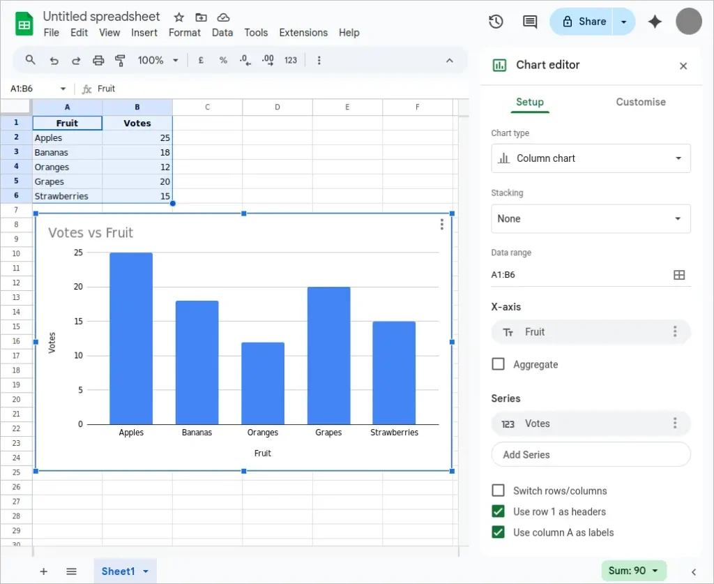
| Fruit | Votes |
|---|---|
| Apples | 25 |
| Bananas | 18 |
| Oranges | 12 |
| Grapes | 20 |
| Strawberries | 15 |
Creating a Vertical Bar Graph (Column Chart) in Google Sheets
A vertical bar graph, often called a column chart, is a popular way to display data that compares categories along a vertical axis. Each category is represented by a column, with the height corresponding to its value. This format is particularly effective for showing growth, differences between groups, or trends over time. By starting with organized data, you can quickly create a column chart that highlights your key insights and makes it easier for others to understand your results.
Follow the steps below to make a vertical bar graph in Google Sheets.
- Enter your data in two columns. For example, column A might list categories, and column B their corresponding values.
- Highlight the entire data range.
- Go to the Insert menu and select Chart.
- In the Chart Editor panel, under the Setup tab, choose Column chart from the Chart type dropdown.
- Customize your chart in the Customize tab for axis titles, colors, and labels.
The following image shows the vertical bar graph created in Google Sheets from the above steps. This method is ideal if you’re using a free bar graph maker like Google Sheets to create polished, shareable visuals.
Creating a Horizontal Bar Graph in Google Sheets
Horizontal bar graphs provide an alternative to the traditional vertical layout, placing categories along the vertical axis and values along the horizontal axis. This approach is useful when category labels are long or when you want to emphasize the comparison of values rather than trends over time. By flipping the axes, you often improve readability and create a visually balanced chart that communicates the data effectively to your audience.
Follow the steps below to make a horizontal bar graph in Google Sheets.
- Follow the same initial steps: enter and highlight your data.
- After selecting Insert > Chart, go to the Chart Editor.
- Under Chart type, choose Bar chart (not column chart).
- Customize appearance as needed.
The following image shows a horizontal bar graph created in Google Sheets by following the above steps. This is a great way to make a bar graph online free without installing any software.

How to Create a Double Bar Graph in Google Sheets
Double bar graphs, also known as grouped bar charts, are ideal for comparing two sets of data side by side within each category. This type of graph is particularly useful when analyzing changes over time or differences between two groups, as it clearly shows both sets of values without cluttering the chart. In this section, we explore how to create a double bar graph in Google Sheets, ensuring your data comparisons are visually meaningful and easy to interpret.
A double bar graph lets you compare two sets of data side-by-side across the same categories. Here’s how to create a double bar chart using Google Spreadsheet bar graph tools:
Example Data
Imagine you want to compare monthly sales for two different products. Your data might include a column for the month, a column for Product A sales, and a column for Product B sales. With this simple structure, Google Sheets can generate a double bar graph that places both products’ sales side by side for each month, allowing for immediate visual comparison and analysis.
The following data is used for creating a double bar graph in Google Sheets below. It is a set of data that contains a students midterm score and final score. As a result, each data column is used in a double bar chart for each student.
| Student | Midterm Score | Final Score |
|---|---|---|
| Alice | 78 | 85 |
| Bob | 65 | 70 |
| Carla | 90 | 92 |
| Daniel | 72 | 75 |
| Eva | 88 | 91 |
To create the double bar graph:
- Column A: Categories (Students)
- Column B: First series (Midterm)
- Column C: Second series (Final)
Select all three columns when creating the chart to ensure both bars show up per category.
Step-by-Step Guide
To build a double bar graph, first select your data range, then insert a chart and choose the “Column chart” option. After that, adjust the settings to group the bars by category rather than stacking them. Customizing colors for each data set and adding clear axis labels further enhances the graph’s readability, ensuring that your comparisons are both accurate and visually appealing. Steps for Google Sheets follow below.
- Enter your data with three columns:
- Column A: Category labels
- Column B: First data series
- Column C: Second data series
- Highlight all three columns.
- Go to Insert > Chart.
- In the Chart Editor, choose Column chart.
- Under the Customize tab, go to Series to assign colors or tweak settings for each data series.
Google Sheets automatically generates a double bar graph by grouping bars for each category. It’s a simple way to make your own bar graph that shows comparisons clearly.
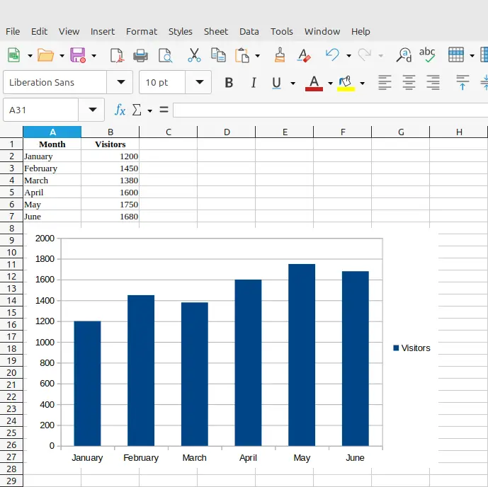
Creating a Bar Graph Using the Free LibreOffice Spreadsheet
If you prefer open-source software, LibreOffice Calc is an excellent option for those looking to make a bar chart free of charge. It works offline and supports detailed customization.
Example Data
Data for creating a bar graph in LibreOffice Calc is shown below. Step-by-step instructions follow below the table. The basic steps to graph this data are:
- You can paste this data into LibreOffice Calc in two columns (A and B).
- Select the data and go to Insert → Chart.
- Choose Bar Chart for a horizontal layout, or Column Chart for vertical bars.
- Follow the chart wizard to customize axis titles and layout.
| Month | Visitors |
|---|---|
| January | 1,200 |
| February | 1,450 |
| March | 1,380 |
| April | 1,600 |
| May | 1,750 |
| June | 1,680 |
Steps to Make a Bar Graph in LibreOffice
- Open LibreOffice Calc and enter your data in two columns (labels and values).
- Highlight your data range.
- Click Insert > Chart from the top menu.
- In the Chart Wizard, select Column or Bar based on whether you want vertical or horizontal bars.
- Choose Data Series in Columns and continue through the wizard to customize titles and legend.
- Click Finish to insert your chart.
LibreOffice is a reliable free bar graph maker that offers control similar to Excel and Google Sheets, without a subscription or online account.
Tips for Graphing Creating a Bar Graph
Creating an effective bar graph requires more than just plotting numbers. Choosing the right scale, labeling your axes clearly, and selecting appropriate colors can make a huge difference in how your data is perceived. Additionally, paying attention to spacing, gridlines, and legends helps ensure that your graph communicates the intended information quickly and effectively.
Simple tweaks, like highlighting key data points or using consistent color schemes, can make your bar graph more engaging and easier to interpret. Thoughtful presentation not only enhances understanding but also adds a professional touch to your reports or presentations.
- Keep category labels short for readability.
- Use consistent colors or color-coding to group related data.
- Use a horizontal bar graph if category labels are too long.
- Always label axes clearly and include units where applicable.
- Sort data in ascending or descending order for better comparisons.
Did You Know About Creating a Bar Graph?
Bar graphs have a fascinating history that stretches back to the 18th century. They were first used as a tool to simplify complex data, allowing people to quickly grasp numerical differences without wading through tables of numbers. Today, bar graphs are used in fields ranging from business analytics to education, health, and even social media metrics.
Interestingly, bar graphs aren’t just for numbers. They can also represent percentages, survey responses, or even abstract concepts like levels of satisfaction or risk. The flexibility of bar graphs makes them an essential tool for anyone who needs to communicate data effectively, whether in print, on a website, or during a live presentation.
The bar graph originated in the 18th century when Scottish engineer and economist William Playfair invented it as a method to compare numerical data. Today, bar graphs remain one of the most popular tools in data visualization thanks to their simplicity and versatility.
Other Interpretations of Creating a Bar Graph
While most people think of bar graphs in terms of numerical comparisons, they can also be used creatively to tell a story with data. For example, infographics often incorporate bar graph elements to highlight trends or make comparisons visually appealing. By thinking beyond raw numbers, you can use bar graphs as a design element that conveys meaning while remaining informative.
When people search for “creating a bar graph,” they may also mean:
- Column Graph Maker: Often used interchangeably with vertical bar graphs.
- Create a Double Bar Graph: Used when comparing two related datasets side by side for each category.
- Grouped Bar Charts or Stacked Bar Charts: Useful for analyzing sub-categories within each main category.
Common Mistakes When Creating a Bar Graph
Even experienced users can make mistakes when designing bar graphs. One common error is using inconsistent scales, which can distort the data and mislead the audience. Another frequent mistake is overcrowding the chart with too many categories, making it hard to read or interpret. Starting with clean, organized data and reviewing your graph carefully helps prevent these pitfalls.
- Using too many bars in a single graph, which makes it cluttered and hard to read.
- Choosing inconsistent or confusing color schemes.
- Forgetting to label axes, titles, or values.
- Misrepresenting data by not starting the y-axis at zero.
Related Graph Types to Explore
Bar graphs are just one way to visualize data, but there are many other chart types that offer different perspectives. Line graphs, pie charts, and stacked bar charts, for example, each have unique advantages depending on the type of data and the story you want to tell. Exploring these options can expand your data visualization toolkit and improve the effectiveness of your presentations.
If you found bar graphs useful, consider learning about:
- Histograms – for visualizing frequency distributions
- Line Graphs – for showing trends over time
- Pie Charts – for visualizing part-to-whole relationships
Explore these in the Graph Types & Chart Examples section of our site.
Frequently Asked Questions About Creating a Bar Graph
Can I make a bar graph online for free?
Yes, you can make a bar graph online free using tools like Google Sheets, Canva, or other dedicated bar chart creators.
What is the difference between a bar graph and a column graph?
A bar graph typically has horizontal bars, while a column graph uses vertical bars. Both display categorical data.
How do I create a double bar graph?
Use tools like Excel or Google Sheets to input two sets of data for each category and choose a grouped bar chart format.
What is the best free bar graph maker?
Google Sheets is one of the most accessible free bar graph maker options. Other good choices include Meta-Chart, ChartGo, and Canva.
Can I make a bar chart free without downloading any software?
Yes, use any bar chart creator available online or tools like Google Sheets directly in your browser.
What is the best tool to make your own bar graph?
It depends on your needs. Use Excel bar chart tools for advanced features or make your own bar graph in Google Sheets for a fast, free solution.
Can I create a bar graph from survey data?
Absolutely. Just list survey categories and their response counts, then create a bar graph using Excel, Sheets, or any column graph maker.
Conclusion
Creating a bar graph is an essential skill for students, researchers, and professionals alike. With multiple free tools like Google Sheets, Excel, and online bar chart creators, you can easily visualize your data and draw meaningful comparisons.
Whether you’re trying to make a bar chart free, create a double bar graph, or simply explore new formats, mastering the art of creating a bar graph will boost your ability to communicate data clearly and effectively.