A scatter chart (also known as a scatter plot or scatter graph) is a powerful tool used to visualize the relationship between two numerical variables. It helps you quickly identify trends, clusters, and correlations in data. In this guide, you’ll learn how to create and interpret scatter charts, explore scatter chart examples, and understand how they reveal relationships between variables.
Table of Contents
What Is a Scatter Chart?
A scatter chart is a versatile visualization tool that allows you to see patterns in data that might not be obvious from raw numbers alone. By plotting each observation as a dot on a coordinate system, you can quickly identify trends, relationships, and anomalies. This makes scatter charts particularly useful for comparing two variables and exploring how changes in one variable might influence the other. They are widely applied in fields ranging from education and business analytics to scientific research.
A scatter chart displays individual data points on a Cartesian coordinate system, with one variable plotted on the x-axis and the other on the y-axis. Each dot represents a single observation in your dataset. This type of chart is ideal for identifying relationships, such as whether two variables move together (positive correlation), move in opposite directions (negative correlation), or have no correlation at all. These charts are commonly used in statistics, research, and business analytics to explore cause-and-effect relationships.
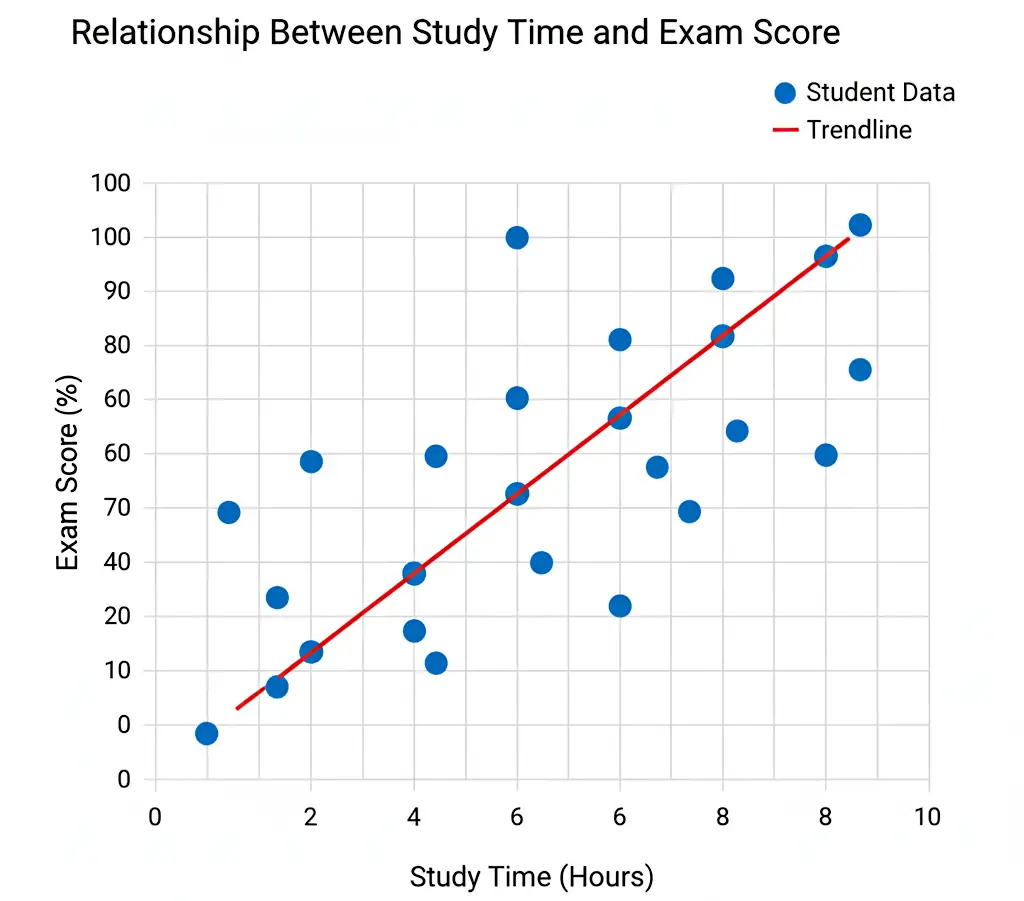
The following images show examples of scatter charts. Firstly on the left the relationship between study time and exam score is plotted. Secondly, the right image shows effect of temperature on chemical reaction rate.

How to Graph a Scatter Chart Step-by-Step
Creating a scatter chart may seem intimidating at first, but by following a systematic process, you can produce a clear and informative graph. The process begins with collecting accurate data, choosing the correct axes, and carefully plotting each point. Paying attention to detail in each step ensures that the final chart accurately represents the relationships between your variables.
Follow these steps to create a clear and accurate scatter chart:
- Collect your data: Gather two sets of numerical values that might have a relationship (e.g., height and weight).
- Set up axes: Label the x-axis with the independent variable and the y-axis with the dependent variable.
- Plot points: Each pair of values (x, y) forms one dot on the graph.
- Look for patterns: Examine how the dots are distributed, do they form a line, cluster, or random spread?
- Add a trend line (optional): A line of best fit can make correlations easier to visualize.
Example Table of Data
Before plotting, it’s helpful to organize your data in a table format. This makes it easier to identify patterns and ensures you have a clear reference for each observation. For instance, a table showing students’ study hours versus exam scores can reveal how study time impacts performance and serves as the foundation for plotting a scatter chart.
When plotted, this scatter chart example shows a clear positive correlation, students who studied more hours generally scored higher on the exam.
| Student | Hours Studied (x) | Exam Score (y) |
|---|---|---|
| A | 2 | 55 |
| B | 4 | 68 |
| C | 6 | 80 |
| D | 8 | 88 |
| E | 10 | 95 |

Understanding Scatter Graph Correlation
A scatter chart’s main purpose is to reveal correlations between two variables. By examining how the data points cluster or spread along the graph, you can determine whether the variables move together, move in opposite directions, or show no apparent relationship. Understanding correlation is essential for interpreting data trends and making informed decisions based on the visualized relationships.
A key concept in scatter plotting is scatter graph correlation, which describes the strength and direction of a relationship between two variables:
- Positive correlation: As one variable increases, so does the other.
- Negative correlation: As one variable increases, the other decreases.
- No correlation: The data points show no clear trend or pattern.
By observing the slope and clustering of points, you can visually estimate the degree of correlation.
Tips for Graphing a Scatter Chart
To make your scatter chart effective and easy to understand, focus on clarity and accuracy. Consistent scaling, clear labeling, and careful use of colors all contribute to a graph that communicates data insights effectively. Thoughtful design choices help viewers grasp the key patterns and trends without being distracted or misled by visual clutter.
Here are some best practices for creating accurate and readable scatter charts:
- Use consistent scaling on both axes to avoid distortion.
- Label clearly: Include axis titles and a meaningful chart title.
- Avoid clutter: Don’t overcrowd the graph with too many data points.
- Use colors wisely: Different colors can represent groups or categories.
- Add a trend line only when it provides meaningful insight into the data.
Did You Know?
The scatter chart was first popularized by 19th-century statistician Francis Galton, who used it to explore relationships between parent and child height. His work on scatter plotting laid the foundation for modern correlation and regression analysis used in statistics today.
Later, scatter charts became a standard tool in scientific research, economics, and social sciences for analyzing complex datasets. Today, scatter charts are integral in data analytics, enabling analysts to identify clusters, outliers, and trends quickly.
With the rise of software tools and programming libraries, scatter charts can now handle thousands of points and multiple variables simultaneously, making them more powerful than ever for large-scale data analysis.
Common Mistakes When Graphing Scatter Chart
Even experienced data analysts can make mistakes when creating scatter charts. Common errors include failing to label axes, misrepresenting data with inconsistent scales, or misinterpreting correlation as causation. Being aware of these pitfalls ensures your charts remain accurate, reliable, and insightful.
- Forgetting axis labels: Without proper labeling, viewers can’t interpret the data correctly.
- Overlapping points: If multiple points overlap, consider using transparency or jittering.
- Assuming correlation implies causation: Even a strong pattern doesn’t mean one variable causes the other.
- Ignoring outliers: Outliers can distort your visual impression of correlation strength.
Related Graph Types to Explore
If you enjoy using scatter charts to visualize relationships, there are several related graph types that can complement your analysis. Line graphs are ideal for showing trends over time, bubble charts allow a third variable to be visualized through bubble size, and heatmaps reveal data density or intensity across two dimensions. Exploring these related graphs can broaden your understanding of data visualization techniques.
If you find scatter graphs interesting, you might also explore these related types:
- Line graph: Useful for showing trends over time. See our article on how to make an Excel line graph to learn how to create a line graph in Excel.
- Bubble chart: Similar to scatter charts but includes a third variable represented by bubble size. See our article Bubble Chart: How to Create One with Examples for more information.
- Heatmap: Displays data density or value intensity across two dimensions.
Frequently Asked Questions
What is the purpose of a scatter chart?
A scatter chart is designed to display the relationship between two numerical variables and reveal patterns, correlations, and potential outliers. By visually representing data points, it allows analysts to quickly assess how one variable may influence another, identify trends, and make data-driven predictions. Scatter charts are particularly useful in exploratory data analysis when testing hypotheses or investigating potential causal relationships.
How is a scatter graph different from a line graph?
A scatter graph emphasizes individual data points rather than connecting them with lines. Each dot represents a unique observation, which allows you to see the exact distribution and spread of the data. In contrast, a line graph typically shows a continuous trend over time or another sequential variable, connecting points to highlight overall patterns rather than individual values.
Can scatter charts show more than two variables?
Yes, scatter charts can represent additional variables using visual cues such as color, shape, or size. For example, bubble charts are a type of scatter chart where the size of each point represents a third variable. Color can also be used to differentiate categories or groups within the data, enabling a more detailed and multidimensional analysis.
What software can create scatter charts?
Scatter charts can be generated using a variety of tools ranging from spreadsheet applications like Excel and Google Sheets to specialized data visualization software like Tableau. Programming libraries such as Python’s Matplotlib, Seaborn, or R’s ggplot2 allow for more complex and customizable scatter plots, including handling large datasets and multiple variables.
What is a scatter plot graph used for in research?
In research, scatter plots are essential for identifying correlations, spotting trends, and detecting outliers within datasets. They provide a visual method to explore the relationship between variables, support hypothesis testing, and facilitate regression analysis. Scatter charts also help researchers communicate findings effectively by offering an immediate, intuitive understanding of complex numerical data.
Conclusion
A scatter chart is one of the most versatile tools for visualizing relationships between variables. By mastering scatter plotting, you can uncover patterns, interpret scatter graph correlations, and make data-driven decisions with confidence. Whether you’re a student, researcher, or data analyst, understanding scatter charts will strengthen your ability to communicate insights visually.
Explore more types of graphs.