Bar charts are one of the most common and effective ways to represent categorical data visually. Whether you’re working on a school project, a business report, or a scientific presentation, making a bar chart helps you compare quantities across different categories at a glance.
In this beginner-friendly guide, you’ll learn how to make a bar chart step by step, choose the right tools, and apply best practices for clear and accurate data visualization.
Table of Contents
- What Is a Bar Chart?
- Step-by-Step Guide to Making a Bar Chart
- Example: Bar Chart in Google Sheets
- Best Practices for Making a Bar Chart
- When to Use a Bar Chart
- Common Mistakes to Avoid when Making a Bar Chart
- Frequently Asked Questions on Making a Bar Chart
- What is the difference between making a bar chart and a column chart?
- Can I make a bar chart with negative values?
- How many categories should I include in a bar chart?
- Should I always use colors in a bar chart?
- Can I make a bar chart in Google Sheets or Excel?
- Are bar charts suitable for showing trends over time?
- Final Thoughts on Making a Bar Chart
What Is a Bar Chart?
A bar chart is a visual representation that makes it easy to compare values across different categories at a glance. Each bar corresponds to a category, and its height or length reflects the quantity or frequency of that category. This makes bar charts ideal for highlighting differences between groups, spotting trends, and presenting data in a format that is simple to understand, whether for reports, presentations, or personal analysis.
A bar chart (or bar graph) displays data using rectangular bars, where the length of each bar represents the value of a specific category. The bars can be vertical or horizontal, and the data is typically plotted along two axes:
- X-axis: Represents categories
- Y-axis: Represents values or frequency
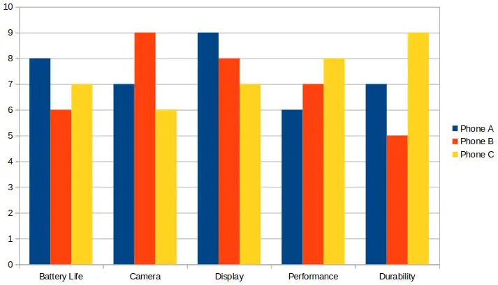
Below is an image of a more complex bar chart that has multiple groups of bars. In this article we make a simple bar chart from a much simpler dataset.
Step-by-Step Guide to Making a Bar Chart
Creating a bar chart is simple once you understand the basic process. Whether you’re visualizing survey results, sales numbers, or comparisons between groups, following a clear set of steps will help you build an effective and accurate chart.
Below is a step-by-step guide to making a bar chart, from collecting your data to styling your final graph for clarity and impact. These are the basic steps to take with any graphing software. A practical example follows that uses Google sheets.
1. Collect Your Data
The foundation of any bar chart is accurate and well-organized data. Start by gathering information that can be grouped into categories, such as survey responses, sales figures, or inventory counts. Organizing your data in a clear table or spreadsheet format makes it easier to plot and ensures that your final chart accurately represents the information you want to convey.
Start with organized data that can be grouped into categories. For example:
| Fruit | Quantity |
|---|---|
| Apples | 50 |
| Bananas | 30 |
| Oranges | 40 |
| Grapes | 20 |
2. Choose a Graphing Tool
Once your data is organized, select a tool that matches your needs and comfort level. Simple datasets can be handled in spreadsheet programs like Excel or Google Sheets, while more complex charts or custom visualizations may require Python libraries like Matplotlib or online chart makers. Choosing the right tool helps streamline the chart-making process and gives you more control over the appearance and style of your graph.
You can use various tools to make bar charts, including:
- Excel or Google Sheets (for simple data sets)
- Desmos (good for math-related charts)
- Python with libraries like
matplotlib(for more control) - Online chart makers like Canva, Meta-Chart, or ChartGo
3. Plot the Data
With your data and tool ready, the next step is to create the chart itself. This involves mapping each category to the X-axis and its corresponding value to the Y-axis, ensuring that each bar accurately represents the data. Many tools automate this process, but understanding how the plotting works will help you interpret and tweak the chart for clarity.
Using your chosen tool:
- Label the X-axis with categories (e.g., fruits)
- Label the Y-axis with numerical values
- Draw one bar for each category, scaling the height (or length) based on quantity
The above steps are done for you automatically when using a spreadsheet, such as Excel or Google Sheets. It is just a matter of entering the data into the spreadsheet, for example from the above example table, and then inserting a graph, and choosing the graph type.
4. Style the Chart
Styling your bar chart is essential for making it both attractive and easy to read. Thoughtful choices in color, labeling, and layout help your audience quickly understand the information being presented. Avoid unnecessary effects that might distract or confuse viewers, and focus on visual clarity and consistency across your chart.
Style the chart to make it easy to read and clear to understand.
- Use consistent colors
- Add axis titles and chart title
- Include labels or a legend if necessary
- Avoid unnecessary 3D effects or clutter
Example: Bar Chart in Google Sheets
To use Google Sheets, you just need a Google account which most people have anyway. Log in to your Google account from a web browser and then go to Google Sheets.
- Enter your data in two columns: one for categories, one for values
- Highlight the data
- Click Insert > Chart using the top menu
- Choose Column chart as the chart type using the Chart type drop-down box at the right of the screen (selecting Bar chart in Google Sheets draws a horizontal bar chart, rather than a vertical bar chart)
- Customize colors, axis labels, and title by clicking on any of these elements in the bar chart and changing its properties in the right Chart editor. You may need to initially double-click an item to get the chart into edit mode.
This is the same example table from near the top of this article. It is used to demonstrate how to make a bar chart in Google Sheets.
| Fruit | Quantity |
|---|---|
| Apples | 50 |
| Bananas | 30 |
| Oranges | 40 |
| Grapes | 20 |
The following image shows the completed bar chart that was made in Google Sheets using the data from the above table with fruit and quantity columns. As can be seen in the image, the data was first entered into the spreadsheet. Be sure to select all the columns and rows, including the headers, before inserting the graph.

Best Practices for Making a Bar Chart
Following best practices ensures that your bar chart communicates information clearly and effectively. By limiting the number of categories, sorting data logically, using contrasting colors, and properly labeling axes, you create charts that are both visually appealing and easy to interpret. These practices help your audience focus on the insights rather than struggling to read the graph.
- Limit the number of categories (5–10 is ideal)
- Sort bars in a logical order (ascending, descending, or categorical)
- Use contrasting colors for better readability
- Always label your axes and units
When to Use a Bar Chart
Bar charts are particularly useful when you want to compare quantities across different groups or categories. They provide a clear, immediate view of differences and patterns, making them ideal for survey results, business metrics, or any scenario where the relationship between discrete items needs to be understood. While they excel at comparison, bar charts are not suited for visualizing continuous trends over time.
Use a bar chart when you want to:
- Compare values across categories
- Show frequency or counts
- Highlight differences between groups
- Visualize survey results or poll data
Bar charts are not ideal for showing trends over time (line charts work better for that).
Common Mistakes to Avoid when Making a Bar Chart
Even a simple bar chart can become misleading if common mistakes are made. Avoid using unnecessary 3D effects, overloading the chart with too many categories, or failing to label axes properly. Choosing hard-to-distinguish colors or cluttering the chart with excessive details can confuse your audience and obscure the message your data is meant to convey. Avoid:
- Using 3D bars that distort perception
- Forgetting axis labels
- Overloading the chart with too many bars
- Choosing colors that are hard to distinguish
Frequently Asked Questions on Making a Bar Chart
What is the difference between making a bar chart and a column chart?
Both display categorical data, but bar charts typically have horizontal bars, while column charts have vertical bars. The choice depends on readability and available space.
Can I make a bar chart with negative values?
Yes, bar charts can show negative values. Bars extend in the opposite direction from the axis, making it easy to compare positive and negative quantities.
How many categories should I include in a bar chart?
For clarity, 5–10 categories are ideal. Too many bars can make the chart cluttered and hard to read.
Should I always use colors in a bar chart?
Colors help differentiate categories and improve readability, but they should be used consistently and thoughtfully to avoid confusion.
Can I make a bar chart in Google Sheets or Excel?
Absolutely. Both spreadsheet programs allow you to quickly create and customize bar charts from your data.
Are bar charts suitable for showing trends over time?
Not usually. Line charts or area charts are better for visualizing trends over time, while bar charts are best for comparing discrete categories.
Final Thoughts on Making a Bar Chart
Making a bar chart is a simple but powerful way to communicate data. By following a clear process and avoiding common pitfalls, you can create charts that are easy to understand and visually effective.
Whether you’re using a spreadsheet, an online tool, or coding your charts in Python, the key is to keep your data clean, your visuals simple, and your message clear.
For examples of different types of graphs and charts, you may be interested in our graph types and chart examples category.
See our article on creating a bar graph step-by-step for more details on using Google Sheets and LibreOffice Calc to create bar charts.