
A time series graph displays data collected over time, making it easier to identify trends, seasonal patterns, fluctuations, and unusual changes. A time series graph typically places time on the horizontal axis and the measured values on the vertical axis. Whether you are tracking daily temperatures, monthly sales, stock prices, or annual population growth, this type of graph helps you understand how a variable changes over time. In this tutorial, you will learn how time series graphs work, which chart types to use, and how to create and interpret them accurately.
What Is a Time Series Graph?
A time series graph is a visual representation of observations recorded at different points in time. The observations are arranged chronologically, allowing you to see how a quantity changes as time passes.
For example, a business might record its monthly sales throughout a year. Plotting these values on a time series graph makes it easy to identify months with high sales, periods of declining revenue, and recurring seasonal patterns.
A typical time series graph has two axes:
- Horizontal axis (x-axis): Represents time, such as seconds, days, months, or years.
- Vertical axis (y-axis): Represents the measured variable, such as temperature, sales, rainfall, or population.
The data points are plotted according to their corresponding dates or times. Depending on the chart type, the points may be connected by lines or represented using bars.
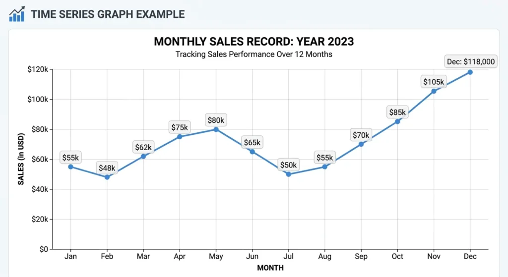
Time series graphs are useful because they preserve the chronological order of observations. Unlike a graph that simply compares unrelated categories, a time series graph reveals how values develop over a period.
Common applications include:
- Business: Tracking revenue, sales, website traffic, and customer demand.
- Science: Monitoring temperature, rainfall, chemical concentrations, and experimental measurements.
- Finance: Examining stock prices, exchange rates, and investment performance.
- Engineering: Measuring voltage, current, vibration, and other changing signals.
- Public Health: Monitoring disease cases, hospital admissions, and health trends.
- Economics: Studying inflation, unemployment, and economic growth.
The essential feature of a time series graph is that the order of the observations matters. Rearranging the data by value instead of time would destroy important information about when changes occurred.
Time Series Graph Examples
The following examples demonstrate how time series graphs can communicate different kinds of information. Each example uses a hypothetical dataset to illustrate a particular pattern.
Example 1: Monthly Sales
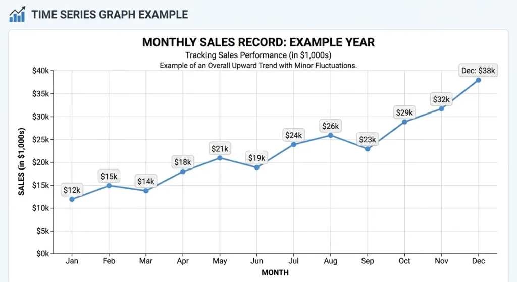
Suppose a store records the following monthly sales figures, measured in thousands of dollars.
| Month | Sales ($1,000s) |
|---|---|
| January | 12 |
| February | 15 |
| March | 14 |
| April | 18 |
| May | 21 |
| June | 19 |
| July | 24 |
| August | 26 |
| September | 23 |
| October | 29 |
| November | 32 |
| December | 38 |
A time series graph of these figures shows an overall upward trend, even though sales decline slightly in some months. The graph makes the general direction of sales easier to recognize than a list of numbers alone.
The example also demonstrates why it is important to examine individual observations as well as the overall trend. A rising sales trend does not mean that sales increase every month.
Example 2: Daily Temperature
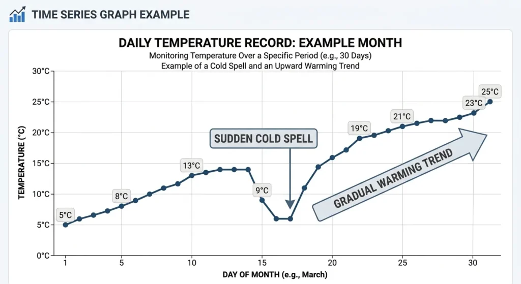
A weather station might record the temperature at the same time every day. A time series graph can reveal gradual warming, sudden cold spells, or repeated daily and seasonal patterns.
A line chart is particularly useful here because temperature is a continuous measurement. Connecting successive observations helps show how the temperature changes between recorded times, although the exact values between observations may not be known.
Example 3: Website Traffic
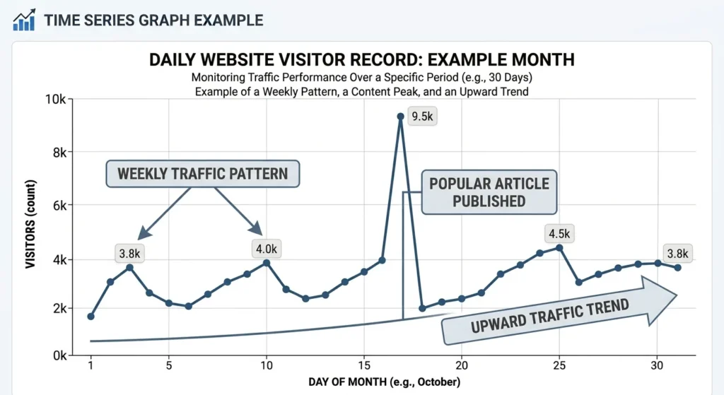
A website owner might record the number of visitors each day. A time series graph can reveal whether traffic is growing, whether particular days have unusually high visitor counts, and whether a marketing campaign coincides with a noticeable change.
For example, a sudden increase after publishing a popular article may appear as a sharp peak. Repeated peaks on particular days of the week could suggest a weekly pattern.
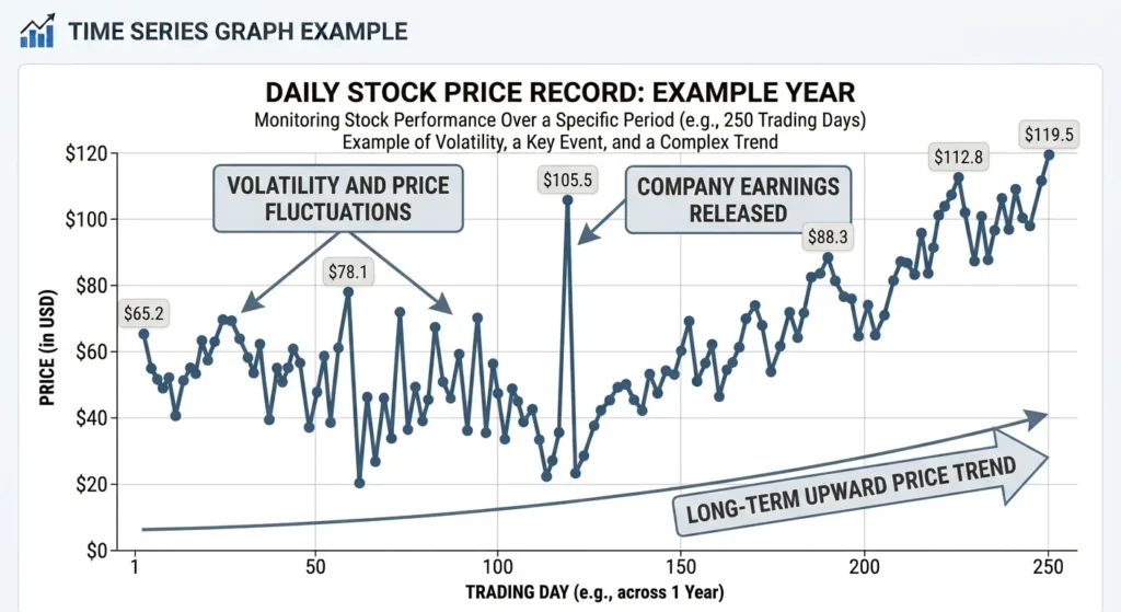
Example 4: Stock Prices
Stock prices are often displayed as time series graphs because investors want to examine how prices change throughout a trading session, across several weeks, or over many years.
A line chart can show the closing price for each trading day. More detailed financial charts may display opening prices, closing prices, highs, and lows using candlesticks or other specialized symbols.
However, a price chart does not automatically explain why a price changed or predict what will happen next. It shows historical observations that must be interpreted in context.
Types Of Time Series Graphs
Several graph types can display time-dependent data. The most appropriate choice depends on the nature of the measurements, the frequency of observations, and the question you want to answer.
Time Series Line Chart
A time series line chart plots observations as points and connects successive points with lines. It is one of the most widely used methods for displaying changes over time. See the examples in the previous section for this type of graph.
Line charts work particularly well when you want to identify:
- Long-term upward or downward trends.
- Short-term fluctuations.
- Turning points and sudden changes.
- Differences between two or more time series.
- Repeated patterns across a period.
For example, a line chart can compare monthly rainfall across several years. Each year can have its own line, allowing you to compare seasonal patterns.
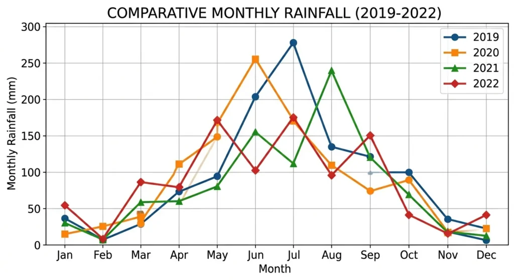
When plotting time series, ensure that the observations are ordered chronologically. Connecting data points in the wrong order can create a misleading picture of the underlying changes.
Line charts are most suitable for ordered observations where the relationship between consecutive measurements is meaningful. If observations are widely separated in time, the connecting lines should not imply that unmeasured values are known.
Time Series Bar Chart
A time series bar chart represents each observation or time interval with a rectangular bar. The height or length of each bar corresponds to the measured value.
A time series bar chart is particularly useful for comparing quantities recorded over distinct periods, such as:
- Monthly sales revenue.
- Daily numbers of visitors.
- Annual population totals.
- Weekly product shipments.
- Quarterly profits.
Bars make differences between individual periods easy to compare. They are especially useful when the measurements represent totals, counts, or other quantities accumulated during defined intervals.
For example, a bar chart of monthly rainfall makes it easy to identify the wettest and driest months. A line chart of the same data might make the overall seasonal pattern more apparent.
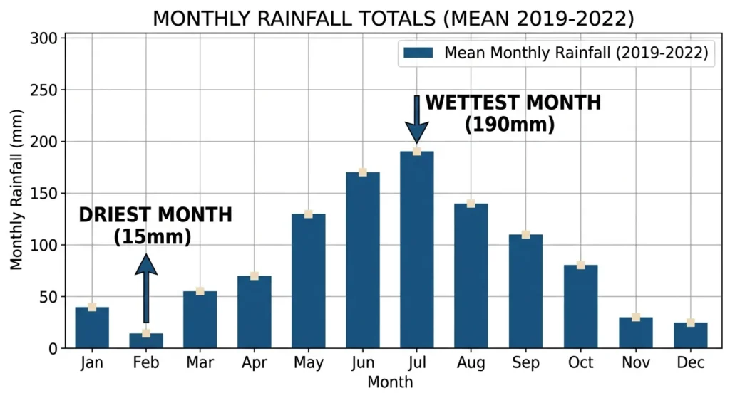
For a conventional bar chart, the value axis should generally start at zero because bar lengths are interpreted by their size relative to a common baseline. Truncating the axis can exaggerate apparent differences.
Time Series Area Chart
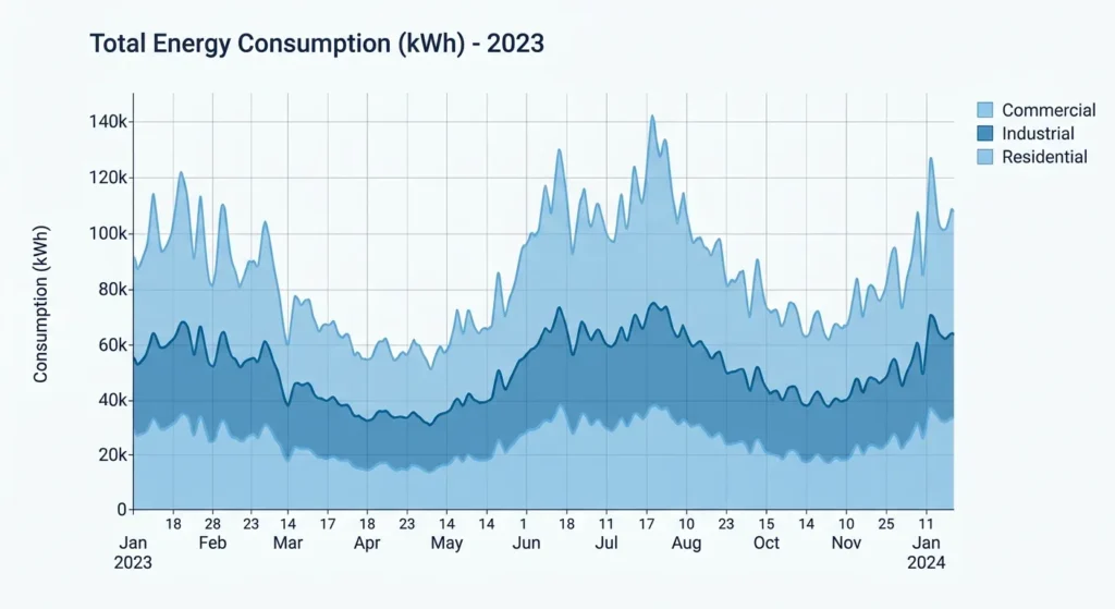
An area chart is similar to a line chart, but the region between the line and the baseline is filled with color. This emphasizes the magnitude of a quantity as it changes over time.
Area charts are useful for displaying quantities such as energy consumption, website traffic, or cumulative totals. They can make the overall scale of a changing quantity more visually prominent.
Stacked area charts can also show how several components contribute to a total over time. However, comparing individual components can become difficult when they do not share the same baseline.
Time Series Scatter Plot
A scatter plot displays individual observations as points without connecting them. When the horizontal axis represents time, it can reveal trends, clusters, outliers, and periods of unusual variation.
A time series scatter plot is useful when you want to inspect the observations without implying a continuous connection between them. It can be particularly helpful when measurements are irregularly spaced or when the individual observations matter more than the path between them.
For many datasets, a scatter plot and a line chart can be combined. The points show the actual observations, while the line helps reveal the overall pattern.
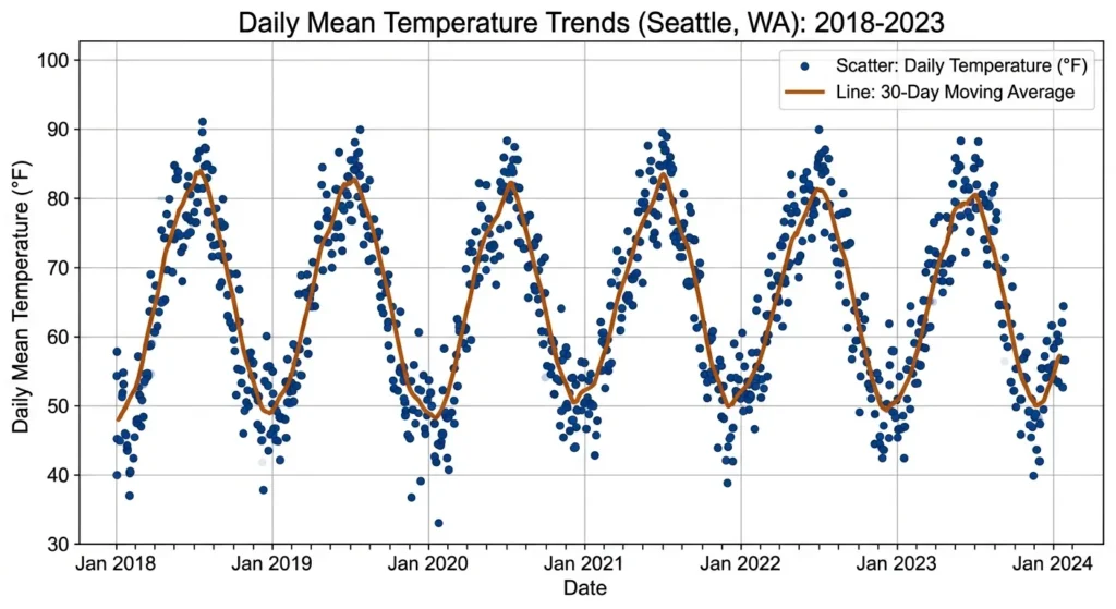
For the above temperature trends example, a clean line chart can hide how volatile weather actually is. Real weather isn’t a smooth mathematical curve, which is why overlaying individual scatter points on top of a thirty-day moving average line is so valuable. These individual data points scatter above and below the trend line, capturing random day-to-day weather volatility, such as an unexpectedly warm spring day or a sudden cold snap.
Ultimately, this combination of raw data and smoothed trends lets viewers see how far individual days deviate from the seasonal norm. The scatter component exposes the true spread of daily temperature changes and highlights extreme weather events as outliers, providing a transparent look at both macro-climate patterns and the unpredictable nature of daily life.
Which Is The Best Graph For Time Series Data?
The best graph for time series data depends on what you want to communicate. A line chart is usually the best starting point when the main goal is to show how a measured variable changes over time. A bar chart is often better when comparing totals or counts across separate time intervals.
Use the following table to choose a suitable graph.
| Graph Type | Best Use | Example |
|---|---|---|
| Line chart | Showing trends and fluctuations | Daily temperatures |
| Bar chart | Comparing values across intervals | Monthly sales |
| Area chart | Emphasizing magnitude over time | Energy consumption |
| Scatter plot | Examining individual observations | Irregular sensor readings |
| Stacked area chart | Showing changing contributions to a total | Energy use by source |
| Candlestick chart | Showing financial price ranges | Daily stock prices |
When choosing a time series chart, consider three questions.
First, are the observations continuous measurements or totals for separate periods? Continuous measurements are often well suited to line charts, while totals and counts are frequently displayed with bars.
Second, are you interested in the overall trend or in comparing individual periods? A line chart emphasizes the direction of change, whereas a bar chart emphasizes differences between periods.
Third, are you displaying one variable or several? Multiple line charts can help compare related variables, while stacked area charts can show how components contribute to a whole.
The clearest graph is the one that makes the intended comparison easy without introducing unnecessary visual complexity.
How To Graph A Time Series Step-By-Step
Creating a time series graph involves organizing observations, selecting a suitable chart type, plotting the values, and checking that the final visualization communicates the data accurately.
Step 1: Collect The Data
Start with observations that include a date or time and a measured value.
For example:
| Date | Temperature (°C) |
|---|---|
| October 1 | 18 |
| October 2 | 20 |
| October 3 | 19 |
| October 4 | 22 |
| October 5 | 24 |
The dates establish the chronological order, while the temperatures provide the values to plot.
Record the units and measurement conditions. If temperatures are measured at different times of day, for example, those differences may affect the interpretation.
Step 2: Arrange Observations Chronologically
Sort the observations from earliest to latest. This is essential because the horizontal axis represents time.
Check for missing dates, duplicate timestamps, and inconsistent measurement intervals. Missing observations should not automatically be replaced with invented values.
If observations occur at irregular intervals, preserve the actual timestamps rather than treating every observation as equally spaced.
Step 3: Choose A Graph Type
Select a graph that matches the purpose of the analysis.
A line chart is usually a good choice for examining trends in measurements over time. A bar chart may be more appropriate for comparing monthly totals, daily counts, or quarterly results.
If the data include multiple variables, consider whether displaying them together will make the graph easier to understand or create unnecessary clutter.
Step 4: Label The Axes
Place time on the horizontal axis and the measured variable on the vertical axis.
For the temperature example, the horizontal axis could be labeled “Date” and the vertical axis “Temperature (°C).”
Choose an appropriate scale for each axis. The horizontal axis should represent elapsed time consistently, and the vertical axis should cover the range of values without hiding important changes.
Step 5: Plot The Observations
Place each observation at the correct position on the graph.
For a line chart, connect successive observations in chronological order. For a bar chart, draw a bar for each defined interval, using a consistent width and spacing.
If using software, verify that dates are treated as dates rather than ordinary text. Incorrectly interpreted dates can result in a graph with misleading spacing or ordering.
Step 6: Add A Title And Context
Give the graph a descriptive title, such as “Daily Temperature During The First Week Of October.”
Include units, a legend when necessary, and a note about the measurement period if it is not obvious.
A well-labeled graph should make sense without requiring the reader to search through the surrounding text to understand what the axes represent.
Step 7: Check The Final Graph
Before interpreting the graph, verify the data and presentation.
- Confirm that all observations are included.
- Check that dates are in chronological order.
- Ensure the axes have appropriate scales and labels.
- Look for missing values or unexpected gaps.
- Make sure lines, bars, and legends are used consistently.
- Confirm that the graph does not imply unsupported conclusions.
These checks help prevent common errors when plotting time series and make the results easier to interpret.
The following related tutorials will help you to draw graphs using popular software packages:
- How to make an Excel line graph teaches how to create a line graph in Excel.
- Making a bar chart for beginners teaches how to make a bar chart in Excel or Google Sheets.
- Our stacked bar chart article gives details on how to create these types of graphs.
- See our area chart article that has instructions on how to make these types of graphs.
How To Interpret A Time Series Graph
A time series graph is useful not only for displaying data but also for identifying patterns that may not be obvious in a table. Several features are especially important when interpreting one.
Trends
A trend is the general direction in which a variable changes over a period.
An upward trend indicates that values tend to increase over time, while a downward trend indicates that they tend to decrease. A relatively flat trend suggests that the values remain broadly stable.
A trend does not mean every observation moves in the same direction. Daily sales may fluctuate while the overall monthly trend remains upward.
Seasonal Patterns
Seasonality refers to patterns that repeat at regular intervals. Examples include higher retail sales during holiday periods, increased heating demand in winter, and recurring changes in electricity consumption.
Seasonal patterns are often easier to identify when a graph covers several complete cycles.
A single increase in December does not establish a seasonal pattern. Repeated observations across multiple years provide stronger evidence of recurring behavior.
Cycles
Cyclical patterns involve extended rises and falls that do not necessarily repeat at fixed intervals. Economic activity, for example, may rise and fall over several years. Unlike seasonality, cycles may vary in duration and intensity.
Recognizing these patterns can help distinguish longer-term fluctuations from regular seasonal changes.
Outliers And Sudden Changes
An outlier is an observation that differs substantially from the surrounding values or the expected pattern.
A sudden spike in website traffic might coincide with a major advertising campaign. An unexpected temperature reading could indicate an unusual weather event or a faulty sensor.
Outliers should be investigated rather than automatically removed. They may represent genuine events, measurement errors, or data-processing problems.
Variability
Variability describes how much the observations fluctuate.
Two time series may have similar average values but very different levels of variation. For example, one might remain close to its average while another experiences frequent sharp increases and decreases.
Looking at variability alongside the trend provides a more complete picture of how the data behave.
Tips For Graphing Time Series
Good graph design makes patterns easier to recognize and reduces the risk of misinterpreting the data. Follow these recommendations when creating a time series graph.
- Use a clear time scale. Choose intervals that match the data, such as hours for machine measurements, days for website traffic, or months for sales reports.
- Preserve chronological order. Never sort observations by value when the purpose is to show how they change over time.
- Choose the right chart type. Use a line chart for trends and fluctuations, or a bar chart for comparing totals across distinct intervals.
- Label axes with units. Include units such as degrees Celsius, dollars, kilograms, or visitors so readers understand the measurements.
- Avoid unnecessary decoration. Excessive grid lines, colors, markers, and three-dimensional effects can distract from the data.
- Use consistent scales when comparing graphs. Different vertical-axis ranges can make similar trends appear very different.
- Handle missing observations carefully. Distinguish missing data from zero values, since zero may be a genuine measurement.
- Show enough context. Include an appropriate date range so readers can identify long-term trends and recurring patterns.
- Use legends for multiple series. Make sure each line or category is easy to distinguish, including for readers with color-vision deficiencies.
- Avoid unsupported extrapolation. A line that rises steadily in the past does not guarantee that the same trend will continue.
For large datasets, consider displaying an appropriate summary, such as daily averages instead of every individual measurement. However, aggregation can hide short-lived events, so retain access to the original observations when those details matter.
Common Mistakes When Graphing Time Series
Even a simple time series graph can be misleading if the data are presented incorrectly. Understanding the following mistakes will help you create more reliable visualizations.
Using Unequal Time Intervals As If They Were Equal
Suppose measurements were taken on Monday, Tuesday, and Friday. Placing all three observations at equal horizontal distances would incorrectly suggest that the time intervals were identical.
When the elapsed time matters, use an axis that reflects the actual timestamps. If the data represent regular daily intervals but some days are missing, show the gaps appropriately.
Confusing Missing Values With Zero
A missing measurement means that the value is unknown or unavailable. A zero means that the quantity was measured or calculated to be zero.
Replacing missing values with zeros can create artificial drops and distort the overall trend. Use a clear method to represent gaps, and document any imputation used to estimate missing observations.
Choosing A Misleading Vertical Scale
A line chart with a truncated vertical axis can make small changes appear dramatic. Although truncation may be appropriate for some analytical purposes, the axis range should be clearly visible and the choice should not mislead readers.
For bar charts, a zero baseline is generally important because bar length represents magnitude.
Connecting Unrelated Observations
Connecting points is useful when the sequence represents a meaningful progression. However, connecting widely separated or unrelated measurements may imply changes that were never observed.
For irregular data, consider a scatter plot or show gaps where measurements are unavailable.
Overloading The Graph With Too Many Lines
Displaying many time series on a single graph can make comparisons difficult, particularly when the lines overlap.
Use a small number of related series, separate the graph into panels, or highlight the most important variables. A legend alone may not be enough to make a crowded chart readable.
Treating Correlation As Causation
Two variables may rise and fall together without one causing the other to change.
For example, ice cream sales and electricity demand might both increase during hot weather. Their shared pattern could reflect temperature rather than a direct relationship between the two variables.
A time series graph can reveal associations, but additional evidence is needed to establish causation.
Other Interpretations Of Time Series Graphs
The term “time series graph” usually refers to a graph that displays observations over time, but related graph types may be more appropriate for particular questions.
Time Series Plot
A time series plot is another common name for a graph that displays observations in chronological order. It often refers to a line plot of successive measurements, although the exact format depends on the software or field.
Time Series Chart
A time series chart is a broad term for a chart showing how a variable changes over time. It may be a line chart, bar chart, area chart, or another format designed to display chronological data.
The terms “time series graph” and “time series chart” are often used interchangeably.
Candlestick Chart
A candlestick chart is a specialized financial visualization that shows opening, closing, high, and low prices during each time interval. It is useful when examining price movements in detail rather than tracking a single measurement.
Gantt Chart
A Gantt chart also uses a horizontal time axis, but its purpose is different. It displays the timing and duration of tasks or activities rather than the changing values of a measured variable.
Function Graph
A function graph shows the relationship between an input and an output. The horizontal axis does not have to represent time, although time-dependent functions can be displayed in this way.
These distinctions matter because graphs that share a time axis do not necessarily communicate the same kind of information.
Did You Know?
The foundations of modern time series visualization developed alongside the growth of statistical graphics in the late eighteenth and nineteenth centuries.
Scottish engineer and political economist William Playfair helped popularize line charts and bar charts in his 1786 book The Commercial And Political Atlas. His visualizations showed how economic quantities changed over time and made complex numerical information more accessible to readers.
Modern time series analysis extends these ideas through statistical methods that examine trends, seasonal effects, auto correlation, and forecasting. Today, time series graphs are used in fields ranging from weather prediction and industrial monitoring to finance and scientific research.
One important distinction is that a graph shows the observed data, while a forecast estimates future values using a model. A projected line should therefore be distinguished from actual measurements.
Frequently Asked Questions About Time Series Graph
What Is A Time Series Graph Used For?
A time series graph is used to show how a variable changes over time. It helps identify trends, seasonal patterns, fluctuations, outliers, and sudden changes in measurements such as temperature, sales, stock prices, or population.
What Is The Difference Between A Time Series Graph And A Line Graph?
A line graph is a general chart type that connects data points with lines. A time series graph specifically displays observations ordered by time and often uses a line graph to show their progression. Not every line graph represents time-dependent data.
What Is The Best Graph For Time Series Data?
A line chart is usually the best starting point for showing trends and fluctuations over time. A bar chart is often better for comparing totals or counts across separate periods. The most suitable choice depends on the data and the intended comparison.
Can A Time Series Graph Use A Bar Chart?
Yes. A time series bar chart displays values as bars arranged chronologically. It works well for monthly sales, daily counts, annual totals, and other quantities measured over distinct intervals.
What Goes On The X-Axis Of A Time Series Graph?
The horizontal axis usually represents time. Depending on the dataset, it may show seconds, minutes, hours, days, months, quarters, or years. The intervals should reflect the actual timing of the observations.
What Goes On The Y-Axis Of A Time Series Graph?
The vertical axis represents the variable being measured, such as temperature, revenue, rainfall, or the number of visitors. Always label the axis and include the measurement units when applicable.
Can A Time Series Graph Show More Than One Variable?
Yes. Multiple time series can be displayed on the same graph to compare related variables or groups. Use clear labels and distinguishable lines. If the variables have very different scales, separate panels may be easier to interpret than a shared axis.
How Is A Time Series Graph Different From A Scatter Plot?
A scatter plot displays individual observations as points, while a typical time series line chart connects observations in chronological order. A time-based scatter plot can still show changes over time, but it does not imply a connected path between measurements.
Can A Time Series Graph Predict The Future?
A time series graph can help identify patterns that may be useful for forecasting, but the graph itself does not guarantee accurate predictions. Forecasting requires an appropriate statistical or machine-learning model and an assessment of its assumptions and uncertainty.
What Software Can I Use To Create A Time Series Graph?
You can create a time series graph using spreadsheet software such as Microsoft Excel or Google Sheets, statistical tools such as R or Python, or dedicated graphing applications. The best choice depends on the size of the dataset, the level of analysis required, and your familiarity with the software.
Related Graph Types To Explore
Understanding related graph types can help you select the most appropriate visualization for your data.
- Line Graphs: Learn how connected data points reveal trends and relationships.
- Bar Graphs: Explore how bars compare values across categories and discrete intervals.
- Scatter Plots: Discover how individual points reveal relationships, clusters, and outliers.
- Area Graphs: Learn how filled regions emphasize changing quantities and contributions to a total.
- Histograms: Understand how numerical observations are distributed across value ranges.
- Function Graphs: Explore how mathematical equations represent relationships between variables.
Each graph type serves a different purpose. Choosing the right one makes the underlying information easier to understand and reduces the chance of drawing incorrect conclusions.
Conclusion
A time series graph is an effective way to understand how data change over time. By arranging observations chronologically, you can identify trends, seasonal patterns, fluctuations, and unusual events that may be difficult to recognize in a table. Line charts are generally best for examining changes and trends, while bar charts are useful for comparing quantities across distinct time intervals. When plotting time series, pay attention to chronological order, axis scales, missing observations, and clear labels. Choosing the appropriate graph and presenting the data accurately will help readers interpret the results and make better-informed decisions.