A spider graph (or radar chart) is a two-dimensional chart where each axis represents one variable. All axes start from the same central point, and data values are plotted as points on each axis. When connected, these points form a web-like polygon—hence the name “spider graph.”
Spider graphs are ideal for visualizing multivariate data, especially when comparing multiple items across the same set of categories.
Table of Contents
- When Should You Use a Spider Graph?
- Spider Graph Example
- How to Create a Spider Graph (Step-by-Step)
- Tips for Using Spider Graphs Effectively
- Pros and Cons of Spider Graphs
- Frequently Asked Question (FAQ)
- Conclusion
When Should You Use a Spider Graph?
Spider graphs are best used when you want to:
- Compare multiple variables or categories simultaneously
- Show performance metrics or characteristics of multiple items
- Display patterns or outliers in multivariate data
Common use cases include:
- Comparing product features
- Displaying skill assessments or survey results
- Benchmarking performance metrics
Spider Graph Example
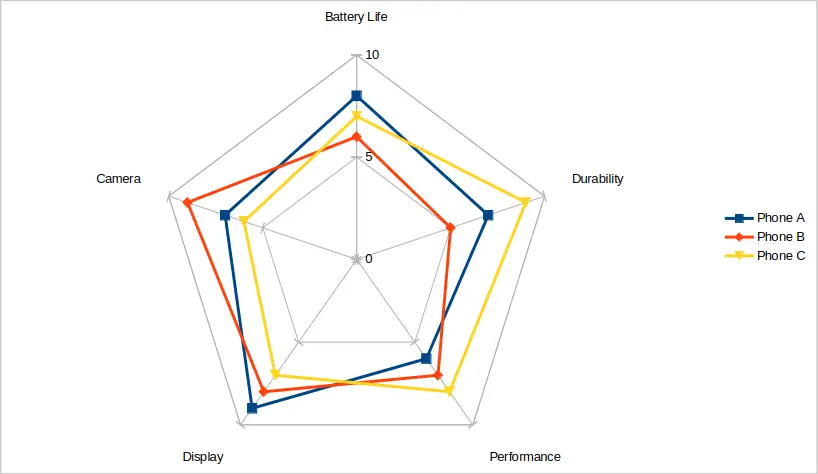
Let’s say you’re comparing three smartphones across five features: battery life, camera, display, performance, and durability.
| Feature | Phone A | Phone B | Phone C |
|---|---|---|---|
| Battery Life | 8 | 6 | 7 |
| Camera | 7 | 9 | 6 |
| Display | 9 | 8 | 7 |
| Performance | 6 | 7 | 8 |
| Durability | 7 | 5 | 9 |
When you plot these values on a spider graph, each phone creates its own shape. You can immediately see which phone performs better in specific categories. The above data is plotted in the image below.

How to Create a Spider Graph (Step-by-Step)
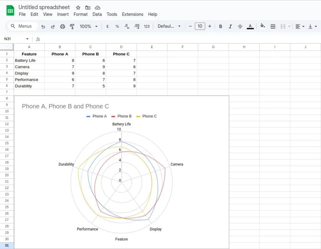
You can make a spider graph using tools like Excel, Google Sheets, or data visualization libraries in Python (e.g., Matplotlib or Plotly).
In Excel
- Enter your categories in a column and data for each item in adjacent columns.
- Select the data range.
- Go to Insert > Radar Chart.
- Choose either Radar, Radar with Markers, or Filled Radar chart type.
- Customize your chart with labels, titles, and colors.
In Google Sheets
- Enter your categories in a column and data for each item in adjacent columns.
- Select the data range.
- Go to Insert > Chart using the top menu bar.
- In the Chart editor at the right of the screen, click the drop-down menu under Chart type. Choose Radar chart from the drop-down list.
- Customize your chart with labels, titles, and colors.

Tips for Using Spider Graphs Effectively
- Limit the number of variables: Too many axes can make the graph unreadable.
- Use consistent scales: Ensure all variables use the same scale for fair comparison.
- Label clearly: Always include axis labels, legends, and a title.
- Don’t overuse: Spider graphs are best for qualitative comparison, not for precise measurements.
Pros and Cons of Spider Graphs
Pros
- Visually engaging
- Great for quick comparisons
- Easy to spot strengths and weaknesses
Cons
- Hard to read with too many variables or items
- Not ideal for showing exact values
- Can become cluttered quickly
Frequently Asked Question (FAQ)
What is another name for a spider graph?
A spider graph is also known as a radar chart, web chart, or star plot.
What kind of data is best for spider graphs?
Categorical, multivariate data where each variable shares a common scale—like rating scores or performance metrics.
Can I use a spider graph for time series data?
Not really. Spider graphs are not designed for time-based trends. Use a line graph or bar chart instead.
Conclusion
A spider graph is a powerful visualization tool when you want to compare multiple variables at once in a clear and compelling way. Whether you’re comparing products, evaluating survey responses, or assessing team skills, a spider graph can help you make data-driven decisions at a glance. Just remember to keep your design simple, scales consistent, and comparisons clear.
You may be interested in our other graph types and chart examples.
