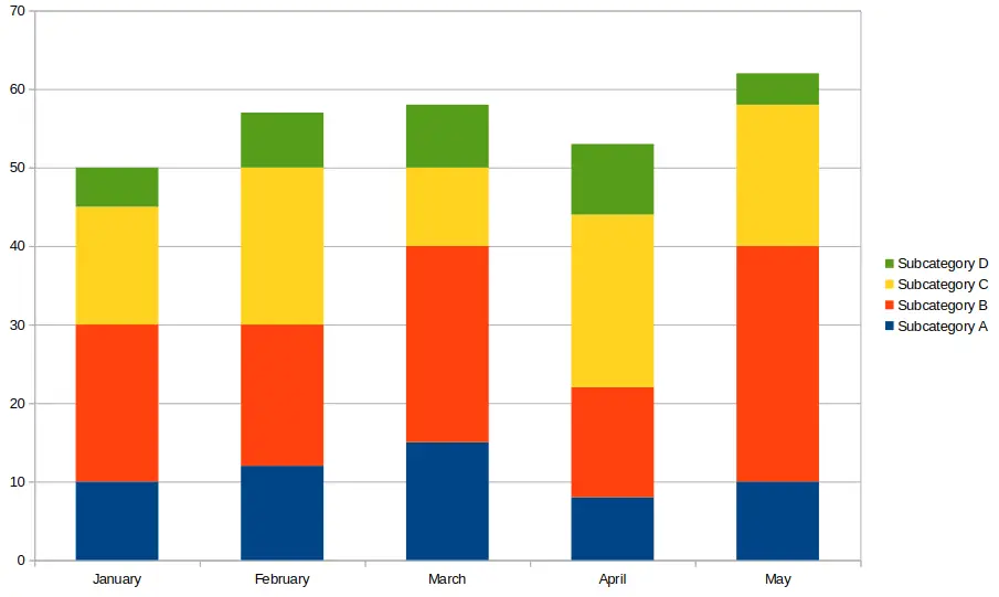
A stacked bar chart is a popular data visualization tool used to compare parts of a whole across multiple categories. They help you see how sub-groups contribute to an overall total and are often used in business reports, presentations, and dashboards. In this guide, you learn what a stacked bar chart is, how to read and create one, and when it’s the best chart type to use.
Table of Contents
- What Is a Stacked Bar Chart?
- When to Use a Stacked Bar Chart
- Types of Stacked Bar Charts
- How to Create a Stacked Bar Chart (Step-by-Step)
- Stacked Bar Chart Example
- Tips for Better Stacked Bar Charts
- Limitations of Stacked Bar Charts
- Frequently Asked Questions (FAQ)
- Conclusion
What Is a Stacked Bar Chart?
A stacked bar chart displays bars divided into segments that represent different sub-categories. Each bar shows the total for a main category, while the segments illustrate the contribution of individual components.
Instead of placing bars side by side (as in a grouped bar chart), stacked bars place them on top of each other (for vertical charts) or next to each other (for horizontal charts). This makes it easier to compare total values across categories while also showing how each segment contributes.

When to Use a Stacked Bar Chart
Stacked bar charts are ideal when:
- You want to compare totals across categories.
- You need to see how individual parts contribute to a total.
- You’re displaying data over time with multiple sub-groups.
Common use cases include:
- Sales data by region and product category.
- Budget allocations across departments and years.
- Survey responses broken down by demographics.
Types of Stacked Bar Charts
There are two main types of stacked bar charts:
1. Standard Stacked Bar Chart
Each bar shows a total value broken into segments. Great for seeing total and sub-category values. See the image above near the top of this article for an example of this type of chart.
2. 100% Stacked Bar Chart
All bars are scaled to the same height (100%), and segments show percentages. Best for comparing proportions across categories. The image below shows an example of a 100% stacked bar chart, also called a percent stacked bar chart.

How to Create a Stacked Bar Chart (Step-by-Step)
You can create a stacked bar chart using spreadsheet tools like Excel, Google Sheets, or data visualization platforms.
Example Data
| Month | Product A | Product B | Product C |
|---|---|---|---|
| Jan | 30 | 20 | 10 |
| Feb | 40 | 25 | 15 |
| Mar | 35 | 30 | 20 |
Steps in Excel or Google Sheets
- Enter your data with categories and sub-categories in columns.
- Select the full dataset including headers.
- Go to Insert > Chart and choose Stacked Bar Chart.
- Adjust chart labels, titles, and colors for clarity.
The following image shows the above example created in Google Sheets.

Stacked Bar Chart Example
Imagine you’re tracking three product lines across different months. A stacked bar chart helps you see both the total monthly sales and how much each product contributes.
You’ll notice that while total sales may increase over time, the proportion of each product might shift—providing insights into performance trends.
Tips for Better Stacked Bar Charts
- Use contrasting colors for clarity between segments.
- Limit the number of segments to avoid clutter.
- Add data labels to show exact values or percentages.
- Sort categories consistently to help users compare data.
Limitations of Stacked Bar Charts
While stacked bar charts are powerful, they can become difficult to read when:
- There are too many segments.
- You need precise comparisons between individual sub-categories.
- Segment values are very small or similar in size.
In those cases, consider using a grouped bar chart or line chart instead.
Frequently Asked Questions (FAQ)
What’s the difference between a stacked and a grouped bar chart?
A stacked bar chart stacks segments within a single bar, while a grouped bar chart places them side by side for easier comparison of individual components.
Can I use percentages in a stacked bar chart?
Yes, you can use a 100% stacked bar chart to display proportional data instead of raw values.
Are stacked bar charts good for time-series data?
Yes. They’re commonly used to show changes over time while also highlighting sub-group contributions.
Conclusion
A stacked bar chart is an effective way to visualize parts of a whole across multiple categories. Whether you’re working with sales data, survey responses, or project budgets, this chart type helps you communicate both total and sub-group values clearly. Just remember to keep the number of segments manageable and label your data for maximum readability.
Use tools like Excel or Google Sheets to create your first chart of this type and gain better insights into your data today.
You may also be interested in our other graph types and chart examples.
